Centrepoint Redesign
Centrepoint Redesign
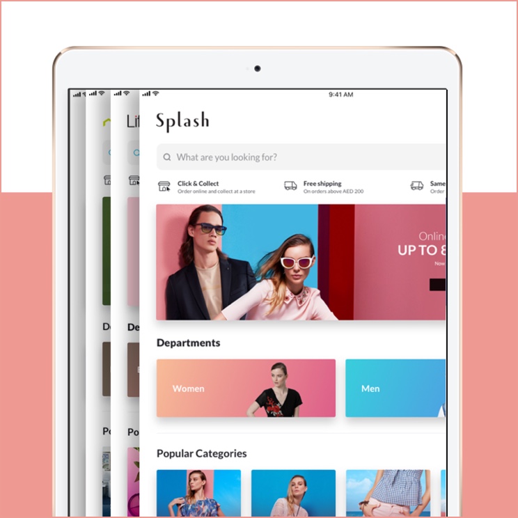
Centrepoint is a well-known retail brand in the Middle East, and it is part of the Landmark Group. Centrepoint brings together a number of popular brands under one roof, including Babyshop, Splash, SHOEMART, and Lifestyle. The store offers a wide range of products, such as clothing, footwear, beauty products, home decor, and more. By combining these brands, Centrepoint aims to provide a convenient one-stop shopping experience for families.
Centrepoint is spread across 8 countries in the Middle East and Africa with 142 stores.
Centrepoint represents the Landmark Group’s strategy to synergize its core 4 retail brands, Babyshop, Splash, SHOEMART, and Lifestyle, under one identity to create a one-stop shopping destination for the entire family.
Centrepoint is spread across 8 countries in the Middle East and Africa with 142 stores.

The CEO's Take on Centrepoint's Online Identity (before the redesign*)
The seed of the project/initiative:
"Landmark Group has spent years building the four brands (Babyshop, Splash, Lifestyle, Shoemart) that Centrepoint represents as one identity. However, these brands do not receive enough prominence on the Centrepoint online platform, whereas the offline stores are well-structured around these four brands."
The missing part: Omnichannel Customer Experience
Omnichannel Customer Experience
The previous online shopping experience at Centrepoint was disjointed from the in-store experience. The lack of alignment between the online platform and the physical store's departmental structure created an inconsistent and confusing experience for customers, particularly those accustomed to shopping at Centrepoint's offline locations. This inconsistency hindered online engagement, especially among traditional in-store shoppers, and created barriers for those attempting to transition between online and offline shopping.
The redesign aimed to create a more unified and intuitive experience across all platforms, reflecting the structure and feel of the physical stores to make the online shopping experience more familiar and accessible.
A seamless customer experience whether the customer is shopping online from a mobile device, a laptop, or in a brick-and-mortar store. Centrepoint’s new online experience for all platforms reflects the exact same structure as the physical stores which makes shopping easy for existing online and new customers who have been shopping from Centrepoint offline. One of the main goals of the project was to create the departmental structure same as offline so we can invite offline customers to online shopping.
High level problem statements
High Level Problem Statements
Navigation Misalignment with Offline Shopping:
The existing online navigation does not align with how customers shop in physical stores, failing to instantly reveal all available departments and thus hindering an intuitive shopping experience.
Current navigation does not reflect how customers shop offline and it does not expose all the available departments instantly.
Lack of Insight into Omni-Channel Customer Behavior:
There is insufficient understanding of the customers' thought process during omni-channel transactions, leaving a gap in creating a seamless transition between different shopping platforms.
We don’t know our online customers thought process while they do omni-chanel transaction.
Inconsistency in Incorporating Core Retail Brands:
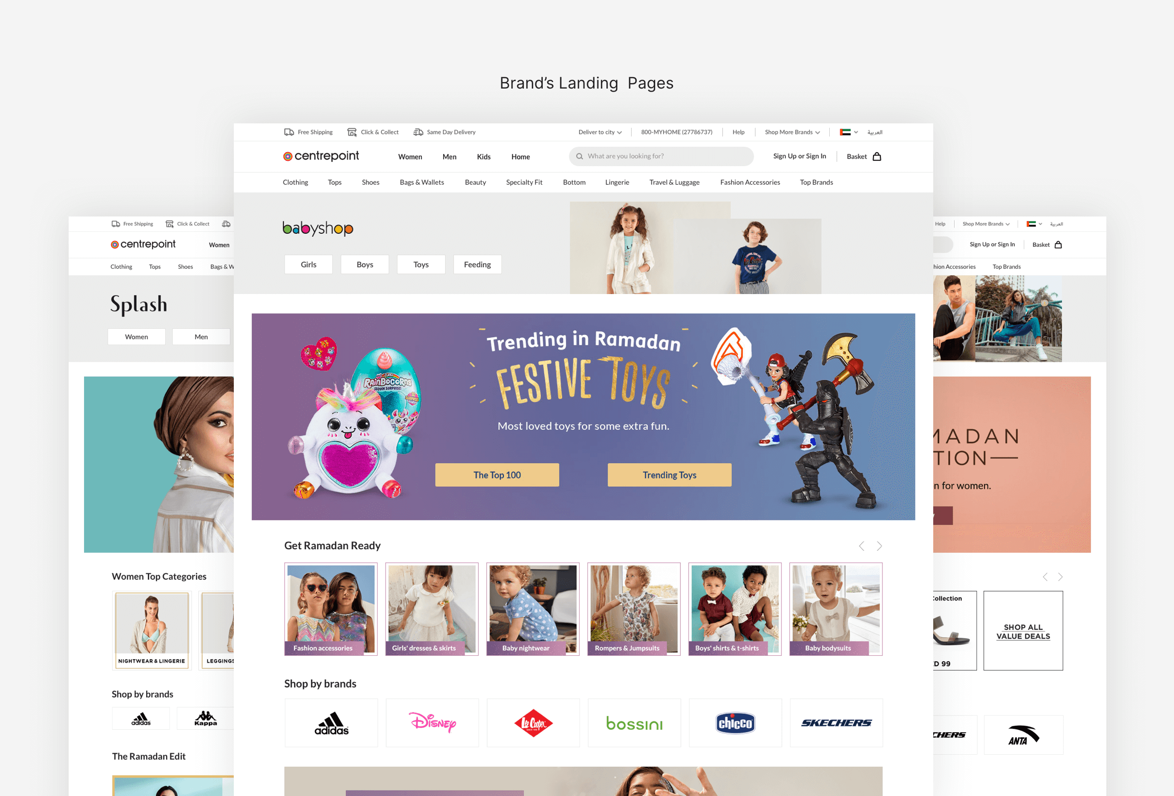
Centrepoint's key retail brands (such as Babyshop, Splash, Shoemart, and Lifestyle) are not as integrated into the online customer journey as they are in offline stores. This discrepancy can lead to a fragmented experience and lessen the engagement with essential brand components.
Centrepoint’s core retail brands (Babyshop, Splash,Shoemaart and Lifestyle) are not part of the customer journey compared to the offline stores.
Business goals
Business Goals
Create a Navigation Structure that Echoes the In-Store Experience:
Design Centrepoint's navigation to mirror the physical store layout, providing a consistent and familiar shopping journey.
Design the Centrepoint Navigation that reflects the structure of the Centrepoint shopping experience.
Develop Scalable Components for Cross-Brand Usage:
Design versatile and scalable components that can be seamlessly implemented within Centrepoint as well as across other brands within the Landmark Group.
Enhance the discovery of the brands in the Centrepoint online platforms.
Amplify Brand Discovery:
Enhance the visibility and accessibility of various brands within Centrepoint's online platforms, fostering a more engaging shopping experience.
Expand the exploration of the categories and allow more space for enough merchandising.
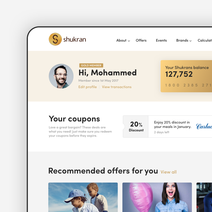
Boost Customer Retention Through Personalization:
Utilize the Shukran loyalty program to offer personalized experiences, thereby fostering customer loyalty and increasing retention. This includes crafting tailored recommendations and incentives that resonate with individual preferences and shopping habits.
Design the scalable components that can be used within Centrepoint and other Landmark Group Brands.
Facilitate Category Exploration and Merchandising:
Expand the navigation of product categories and allocate sufficient space for effective merchandising, allowing customers to delve into a broader array of products.
Increase customer retention by giving the users a personalized experience and making the most use of the Shukran loyalty program.
Reevaluating Success: The Need for Change
For 8 years, the existing navigation structure was serving its purpose. Products were being delivered to our customer's doorsteps, targets were being met, and customers were finding the products they needed. However, we realized that merely meeting expectations wasn't sufficient; we sought to exceed them.
CX audit summary
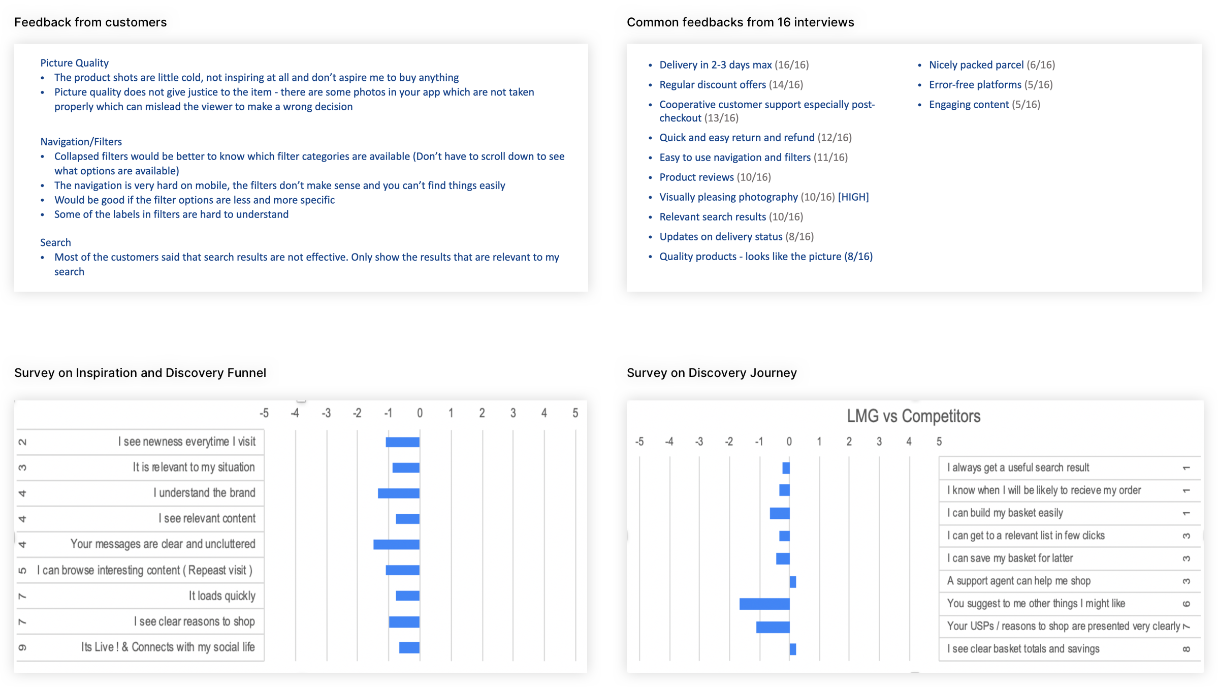
We began by conducting a quantitative survey to gauge our position relative to both local and international competitors. In addition to enhancing Centrepoint's brand presence, a central aim of the project was to refine the journey of 'Inspiration, Discovery, and Promotions,' with a goal of boosting the 'Add to Cart' rate.

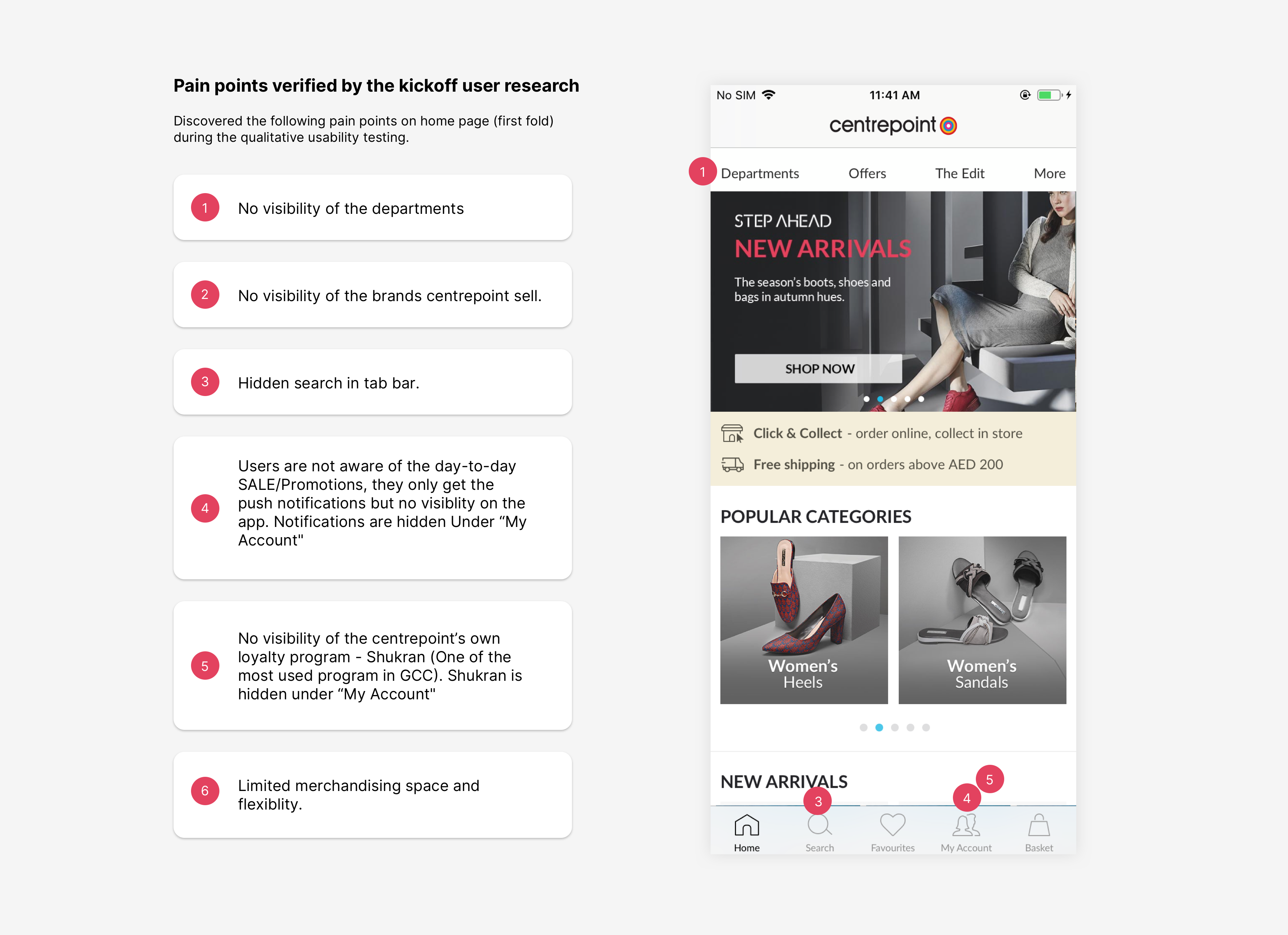
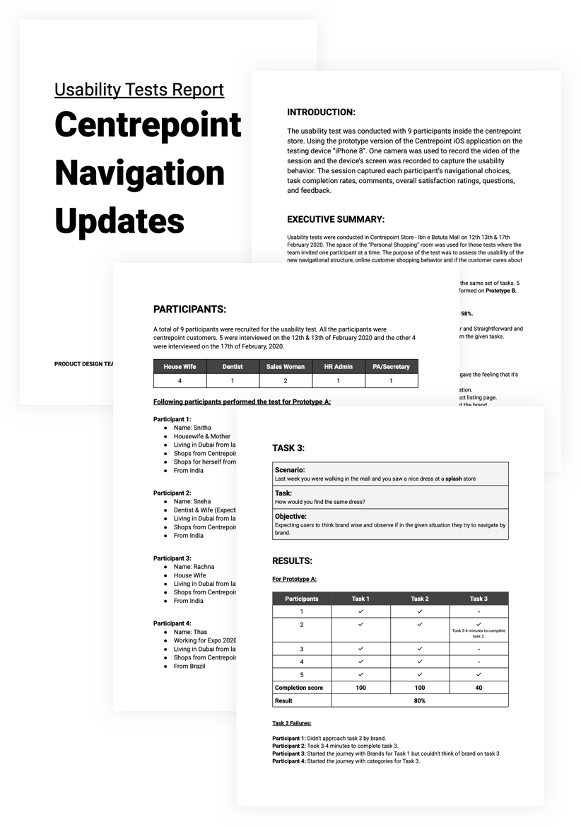
Understanding users (Usability testing sessions).
Understanding users (Usability testing sessions).
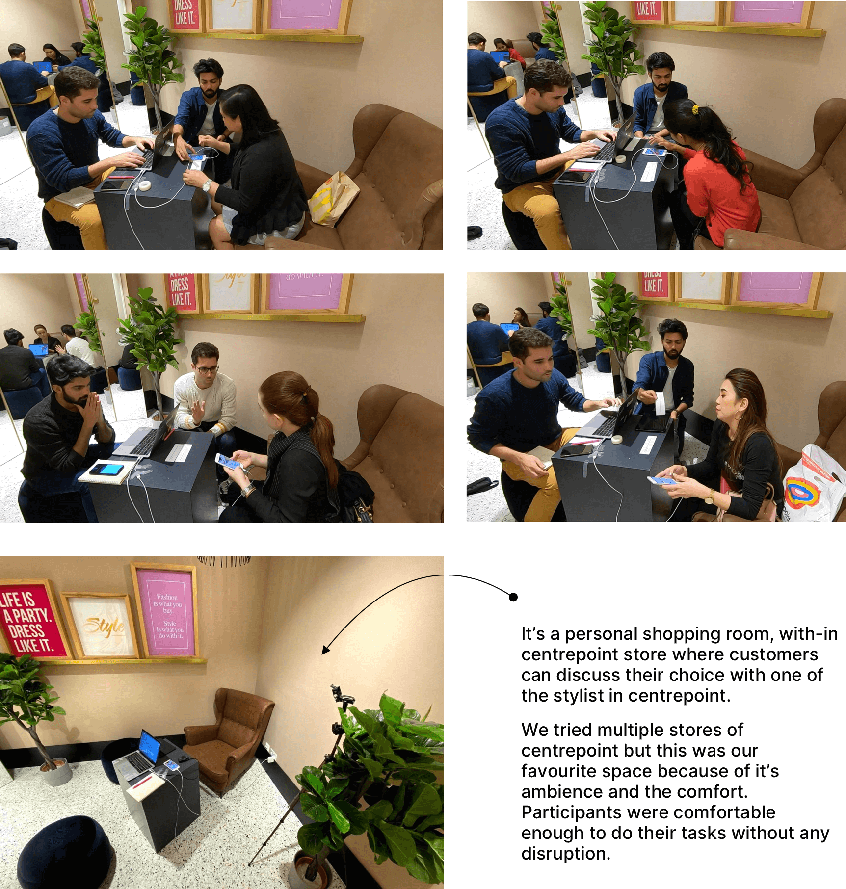
Diego Faria and I conducted six sessions for the redesign of Centrepoint.com. Each session included five in-store customer interviews and usability tests, totaling 30 interviews. I've compiled an article detailing all the insights and recommendations gathered from these sessions.
Comprehensive Report on Customer Interviews and Usability Tests.
Testings and interviews sum up
I compiled a comprehensive report on the usability tests we conducted, outlining the results and insights gathered from customer interviews. This report served to efficiently communicate our findings to stakeholders across various regions, streamlining the process by eliminating the need for numerous presentation meetings.
The report included detailed descriptions of the personas for each participant and provided specifics on when, where, and how the usability tests were conducted. Additionally, it elaborated on the discoveries and learnings from one-on-one interviews with customers, including direct quotations to encapsulate their perspectives.
I created a report on the conducted usability tests to present the results of tests and the learnings from the customer interviews to all the stakeholders. The report also helped to communicate faster across all the regions (lots of presentation meetings were skipped).
The document briefly explained the personas for each participant, Also when, where and how the usability tests were conducted.
The document also explained the discoveries/learnings on 1:1 interviews with the customers and their verbatims.
The Core Improvements
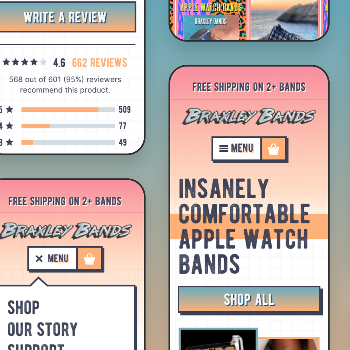
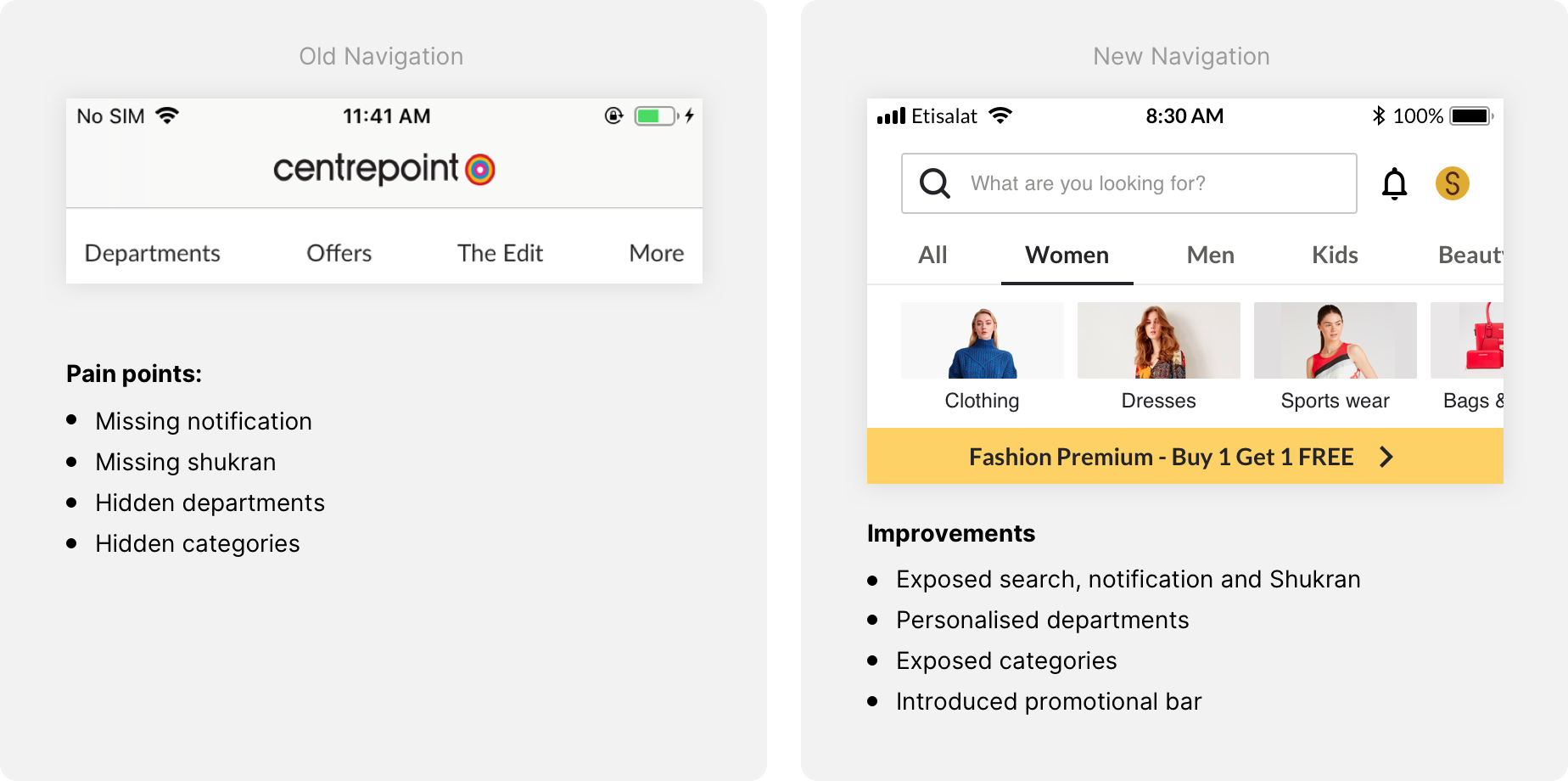
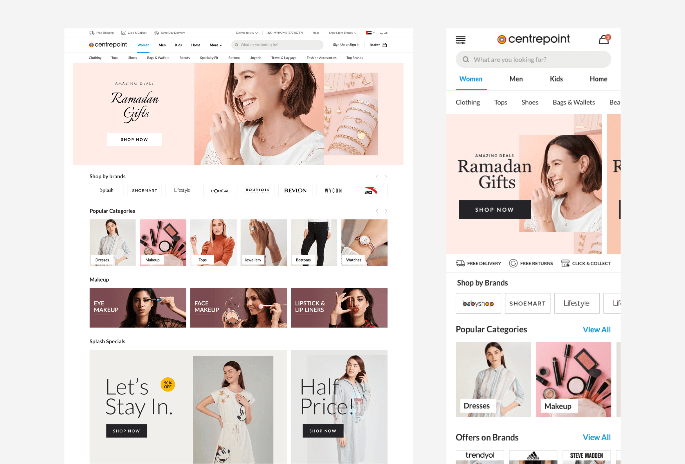
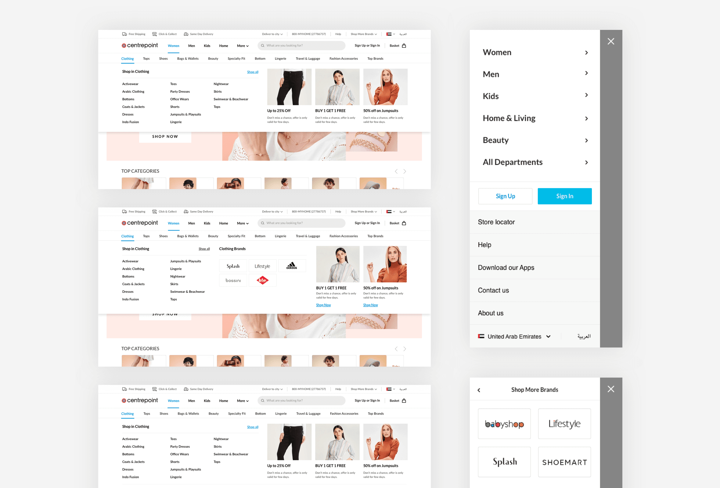
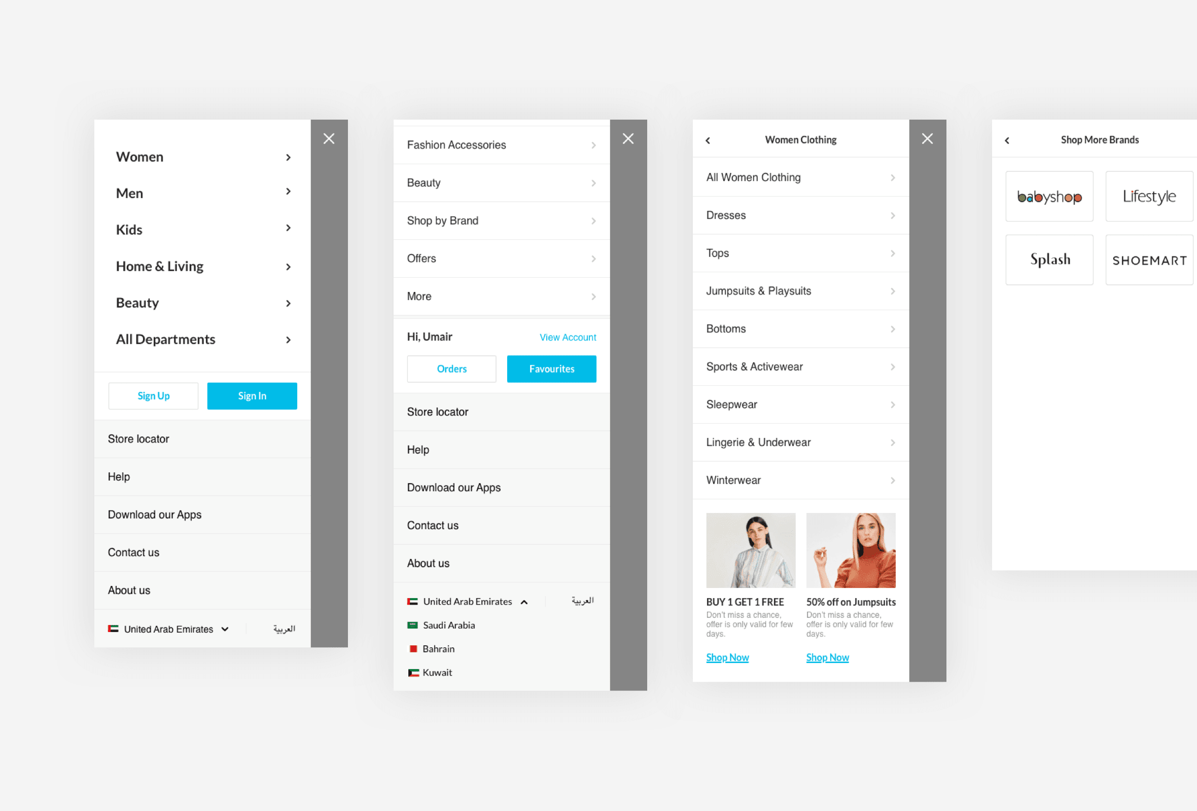
Navigation Updates
In the previous navigation structure, all the departments and categories were nested under the "Departments" section. By exposing the departments and categories, we made the categories more instantly accessible to users. Usability testing further demonstrated a +20.32% increase in visits to product listing pages with real users.
Additionally, the creation of dedicated inspirational department landing pages contributed to a 13% reduction in the exit rate.
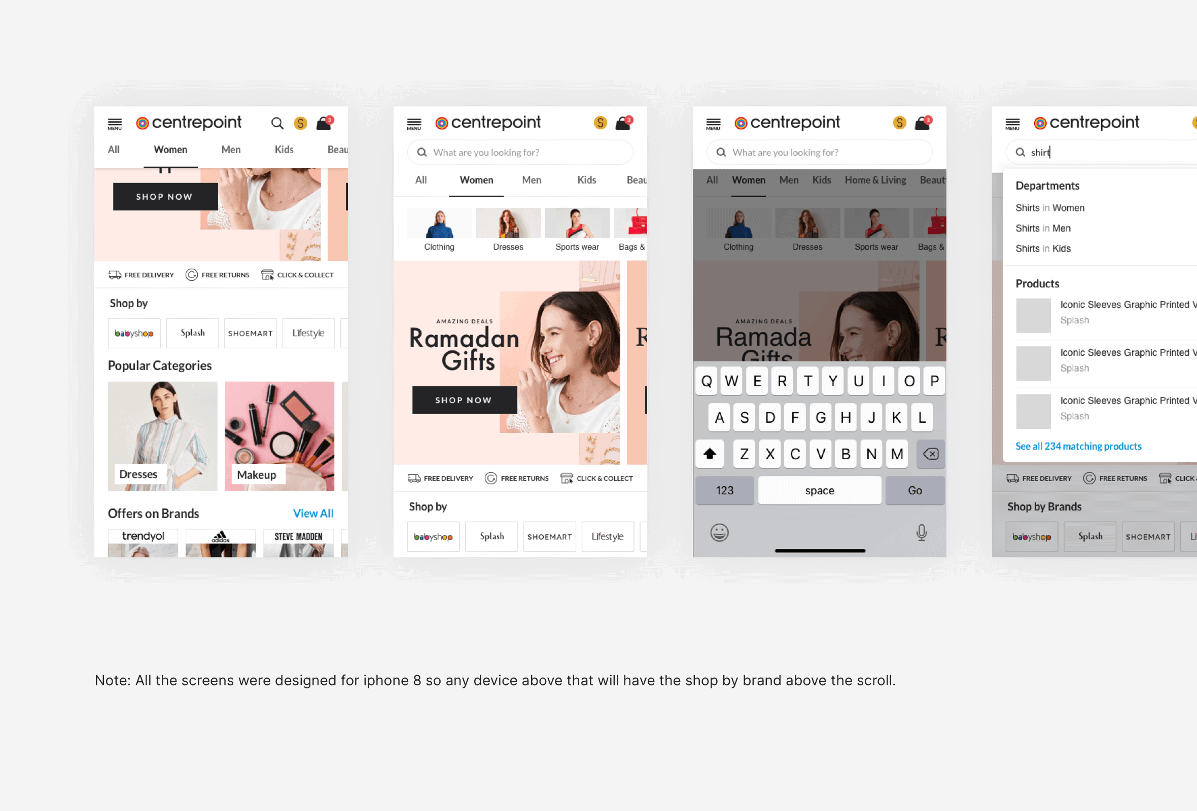
Another success was seen in the search function on the home page, where sessions utilizing search increased by 9%.
In the old navigation structure, all the departments and the categories were nested under "Departments", exposing the departments and categories resulted in an instant approach to categories for the users while usability testing which further resulted in +20.32% increase on product listing pages with real users.
Creating the dedicated inspirational department landing pages reduced the exit rate by 13%.
The search was another success on the home page, sessions with search increased by 9%
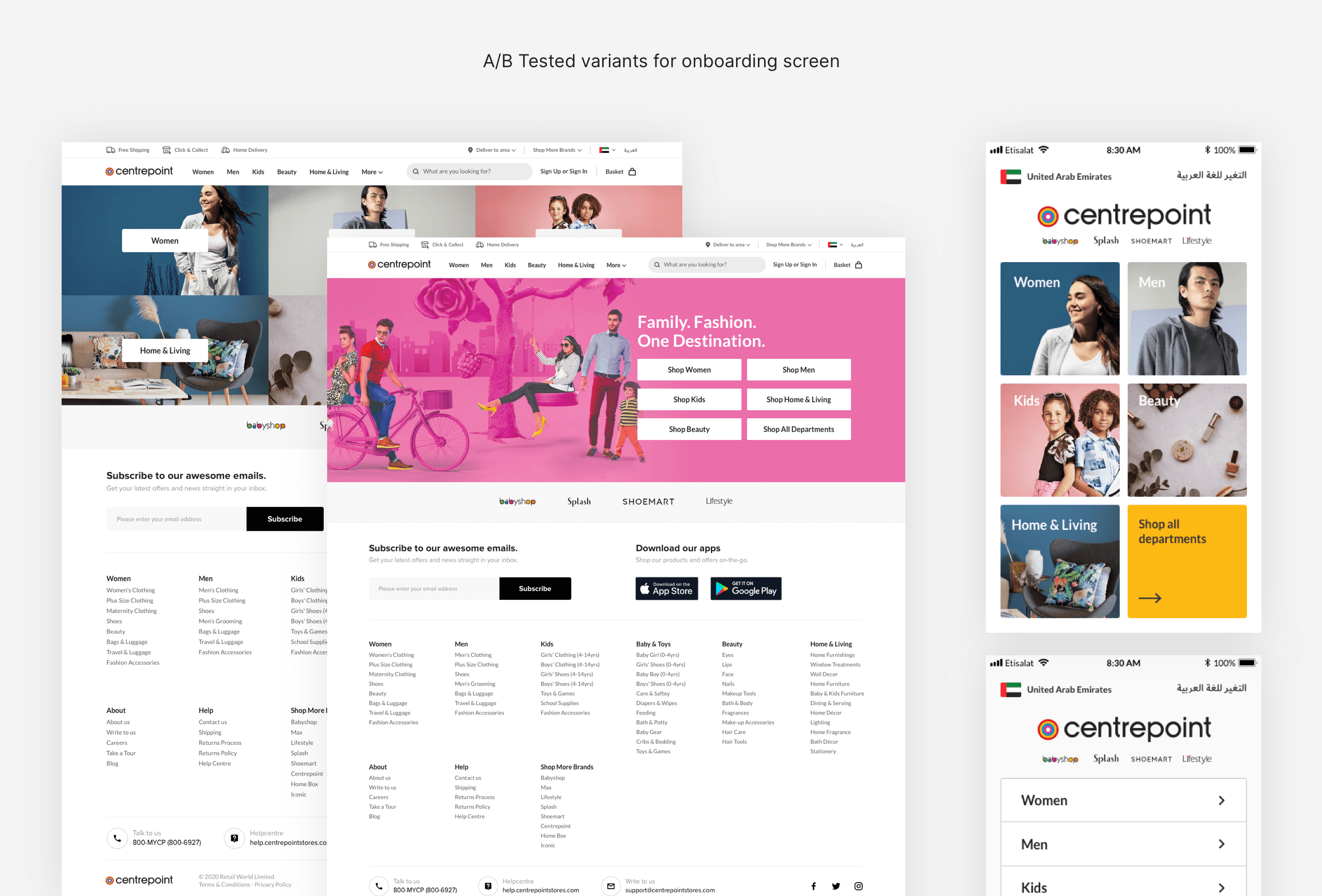
Hero Banners
Reduced the size of the banner and showed the peek of other banners to improve the visibility.
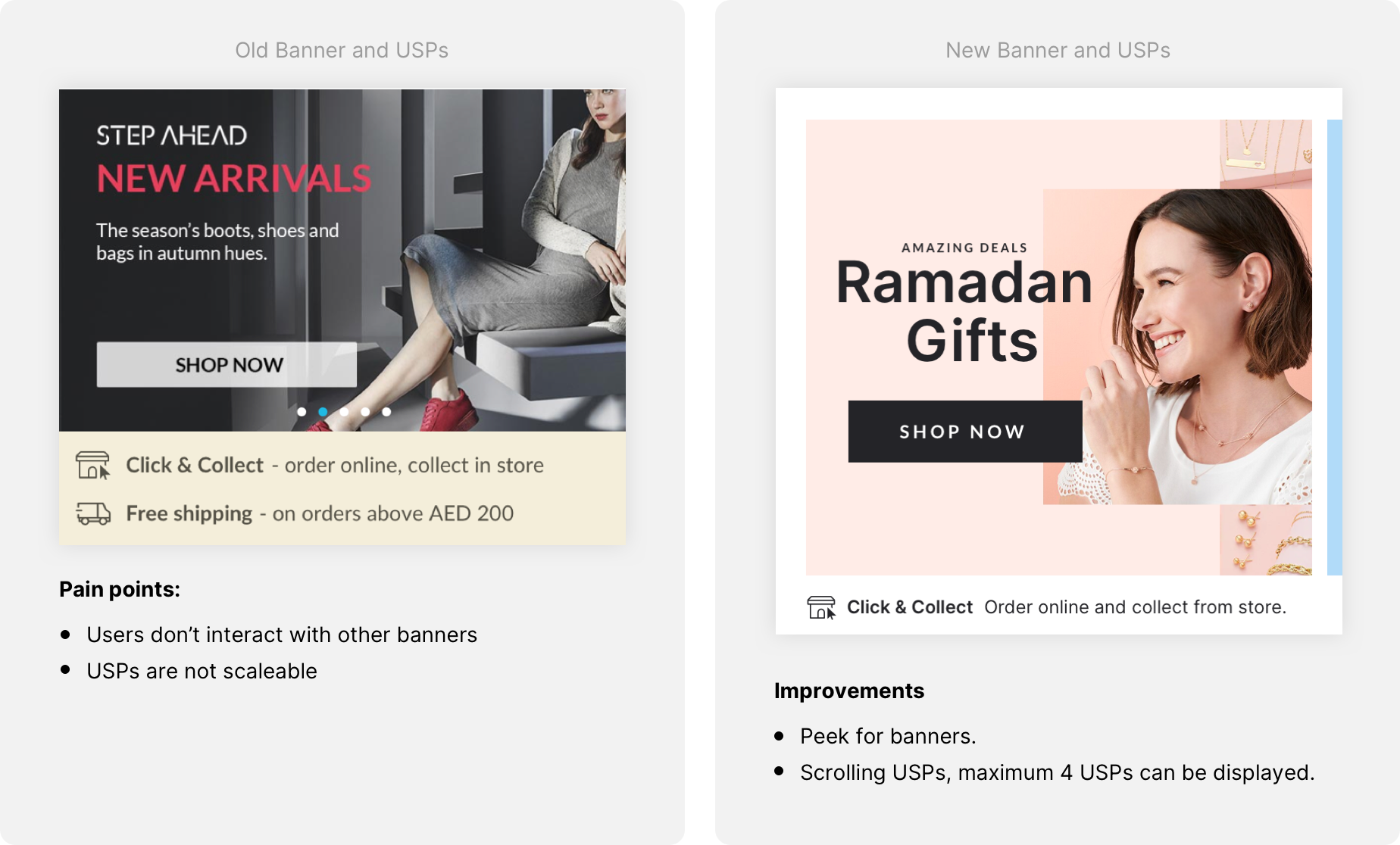
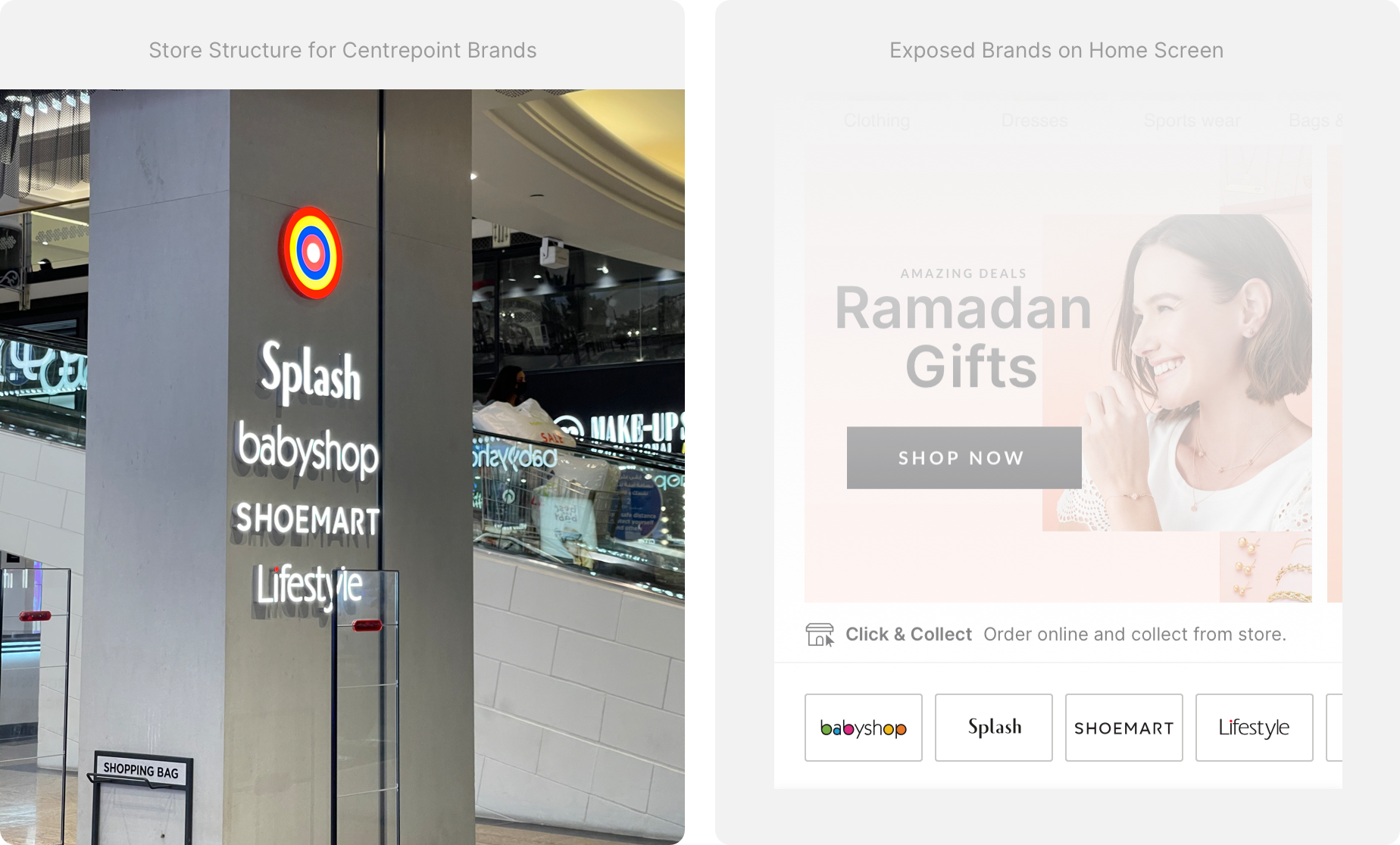
Consistent Brands Visibility
The Centrepoint (CP) retail brands were prominently featured on the homepage, positioned under the hero banner, to mirror the offline store's experience. Each brand now links to a dedicated landing page, allowing users to explore and shop exclusively within that specific brand's collection.
By creating individualized and inspirational department landing pages for each brand, we were able to reduce the exit rate by 13%, enhancing user engagement and retention on the site.
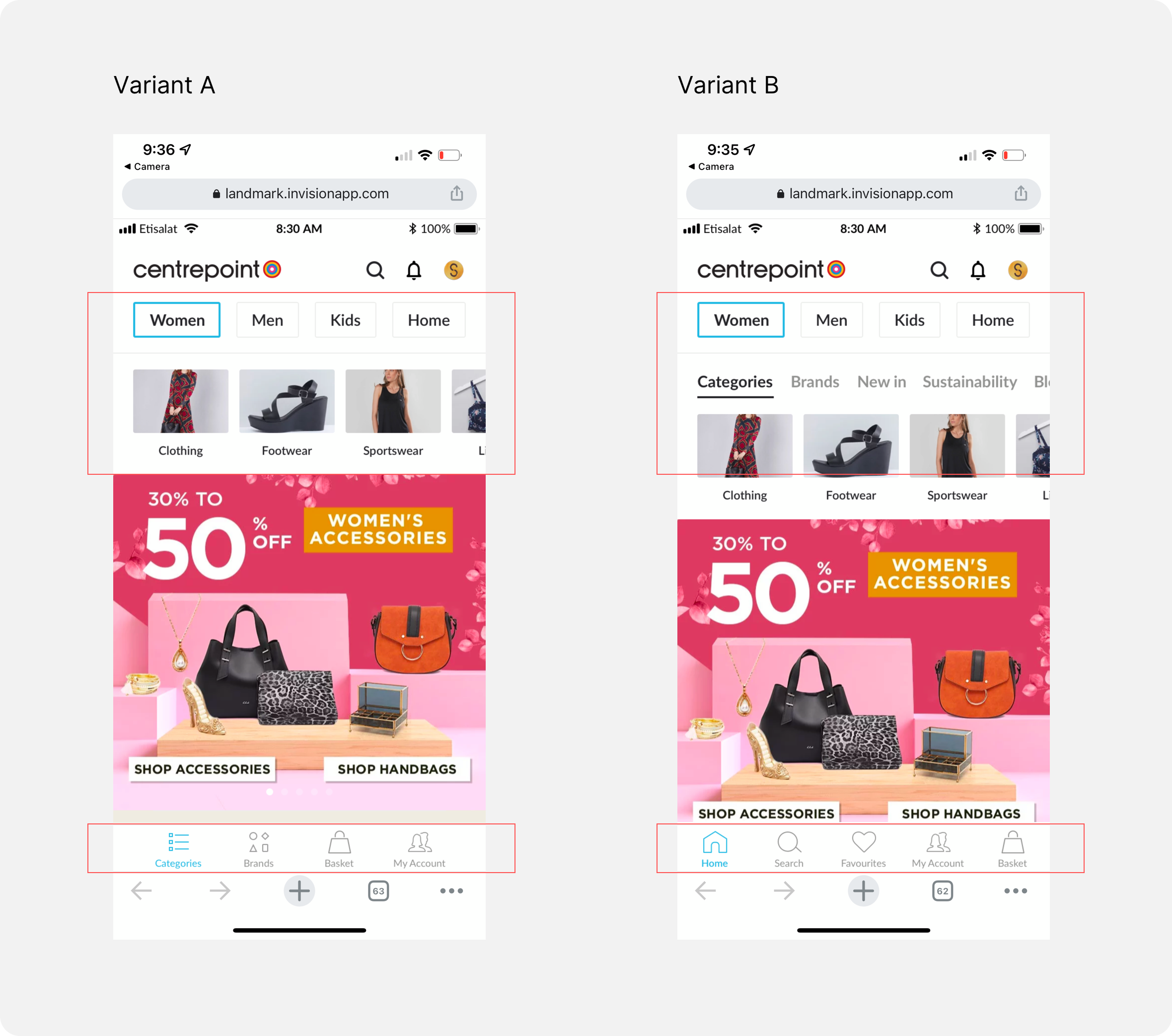
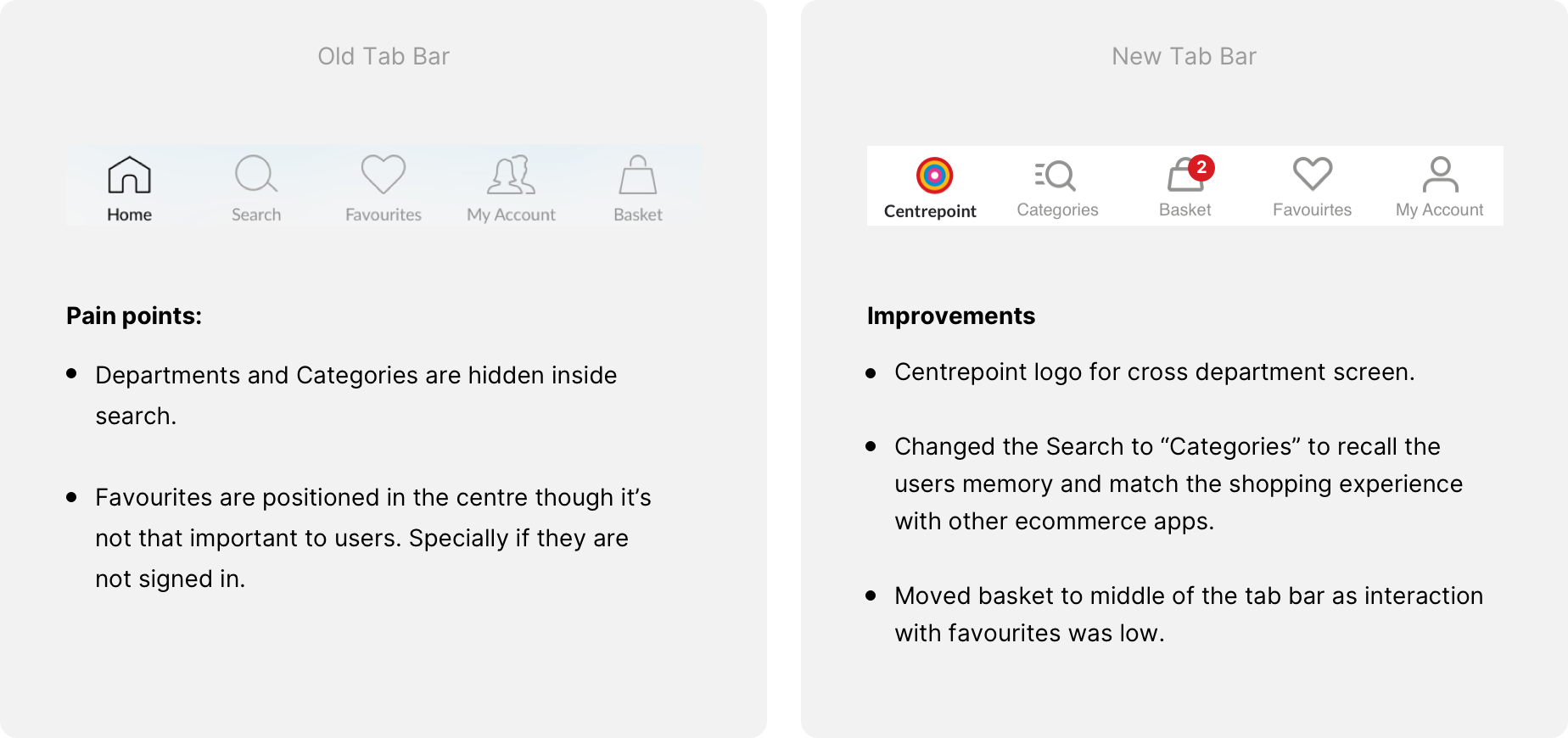
Tab bar updates
The click-through rate (CTR) for the "favorites" feature was notably low, and it became evident that the central position of the favorites tab could be utilized more effectively. We decided to utilize this prime spot for the shopping basket, aiming to capture users' attention with a display of the number of products in their cart.
With the search function already prominently displayed on the homepage, we decided to replace "Search" with "Categories." This change was complemented by updating the corresponding icon, enhancing the overall functionality and user experience.
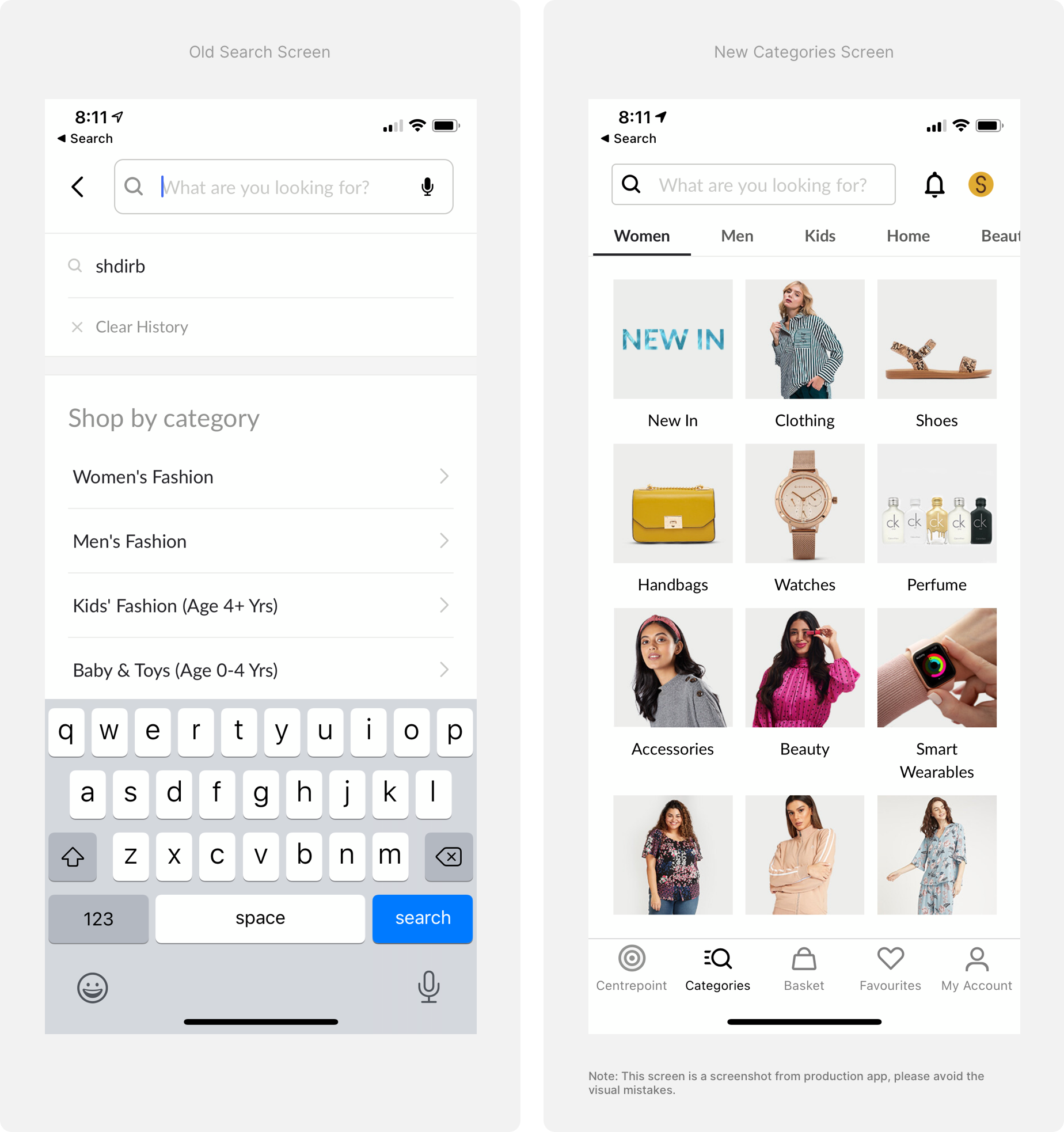
From search to category thumbnails
The UX problem with the previous design of the search screen was that it prioritized the search function over the "Shop by Categories" feature. As the number of recent searches increased, each additional search term pushed the "Shop by Category" section further down the page. Furthermore, the navigation for Departments and Categories was entirely text-based, lacking any visual or interactive elements to enhance user engagement.

Design Execution Strategy:
Transparent and solid collaboration between the creative team and the engineering team was a fundamental part of the project. This was especially crucial as the new structure was being designed not only for Centrepoint but also for Splash, HomeCentre, Homebox, Babyshop, and Lifestyle.
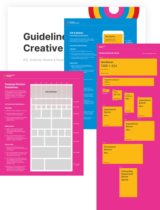
During the interim phase between the completion and handover of the designs, I formulated a guideline to maintain alignment among the engineering team, creative team, and stakeholders.
These platform-specific guidelines (for iOS, Android, and mobile web) were carefully designed to shed light on every detail of the project. The intention was to preemptively answer most of the questions that any team member might have, thereby facilitating a smooth and coordinated project execution.
Adapting to Other Centrepoint Brands through Testing and Smart Implementation:
We initially tested the Centrepoint updates and waited to gauge their success. Following positive results, we proceeded to apply the same strategies to other Centrepoint brands.
Before diving into implementation, my co-designer and I conducted individual customer interviews and usability test sessions with the loyal customers of each brand.
This research phase was instrumental in allowing us to fine-tune the user experience to meet the unique needs and preferences of each brand's audience. By approaching each brand with a tailored strategy, we were able to craft experiences that resonated specifically with their distinct customer bases.

Insights Gained from the Project:
Effective Collaboration: Early and active collaboration among the various teams can lead to a smoother and faster execution process. My project manager excelled in this area, orchestrating bi-weekly updates for each department and key stakeholders.
Tailoring the Experience: It’s essential not to merely replicate an experience from one brand to another just because it worked once. Conducting thorough research to understand the unique needs of each user is crucial.
Efficiency in Customer Interviews: When recruiting candidates for customer interviews in a physical store, leveraging the assistance of staff is more efficient than approaching customers directly, as it prevents disruption to their shopping experience.
Incentivizing Participation: We found that offering discount coupons through billing receptionists upon checkout helped us engage interview candidates more quickly.
Creating and Utilizing Guidelines: Developing clear guidelines and referring to them for every question posed by different teams is vital for ensuring everyone stays on the same page. While answering a question directly might seem quicker, aligning all parties with common guidelines fosters long-term cohesion and understanding among the team members. By doing so, you not only assist yourself but also aid in the development of a collective team understanding.
Team Mates
Other Projects
Other Projects