Shukran
Shukran is a loyalty program that operates in the Middle East. It's one of the largest loyalty programs in the region and allows members to earn and spend points across various retail stores. Shukran members can earn points on purchases and then redeem those points for discounts on future purchases. Different brands and stores may participate in the program, offering customers a way to save money and gain rewards for their loyalty.
Shukran
Shukran gives the liberty to earn and spend Shukrans on customer's purchases. It’s the biggest and the most successful retail loyalty program in the Middle East which serves with an extremely rewarding shopping experience across the Landmark Group brands or LMG partner brands.
The Challenge
Shukran's loyalty program faced challenges as it aimed to expand in the Middle East. They needed to modernize their physical loyalty card, boost app downloads, and attract more partner brands. Members were confused about different membership tiers, point usage across borders, and how to manage their accounts. Information like store locations and exclusive offers were not easily accessible. The project's redesign targeted these issues by updating the loyalty card to a digital version, simplifying app usage, clarifying membership benefits, and enhancing the visibility of offers and store locators. The goal was a more user-friendly experience to engage current members and attract new partners.
I worked on Shukran for a year and a half (of course along with other Landmark’s e-commerce brands). The project started in January 2018 and I joined the end of February 2018, Initially, I designed the Desktop and Mobile experience and then after the launch in July 2018 it was handed over to me fully to own it as it’s product designer. From then I was responsible for followings:
My responsibilities encompassed the following areas:
- Worked in collaboration with product owners, managers, engineers, and various multi-functional teams to build a unified consensus around concepts.
- Led the design of both user experience and interfaces across all of Shukran's digital platforms, maintaining a consistent and intuitive user journey.
- Advocated for the end-users by relentlessly pursuing ways to enhance their experience and aligning it with Shukran's values.
- Conducted user interviews and surveys, using the feedback to validate and refine the designs, ensuring they met user expectations.
- Developed wireframes, mockups, and interactive prototypes as a means to communicate and test user behavior and response to design elements.
- Continuously monitored loyalty user needs, using insights to explore new opportunities that would enhance Shukran's offerings.
- Conducted UX-QA for interfaces to ensure accuracy and consistency across platforms, fostering a uniform user experience.
- Drive user experience and interface design across all digital platforms of Shukran.
- Collaborate with product managers, engineers, and multi-functional teams to build concept consensus.
- Advocate for the end user by always seeking ways to improve their experience.
- Conduct and participate in user experience research.
- Design wireframes, mockups, or interactive prototypes to communicate and test user behaviour.
- Keeping an eye on loyalty user needs to explore new opportunities for Shukran.
- QA interfaces for accuracy and to keep consistency across the platforms for uniformed user experience.
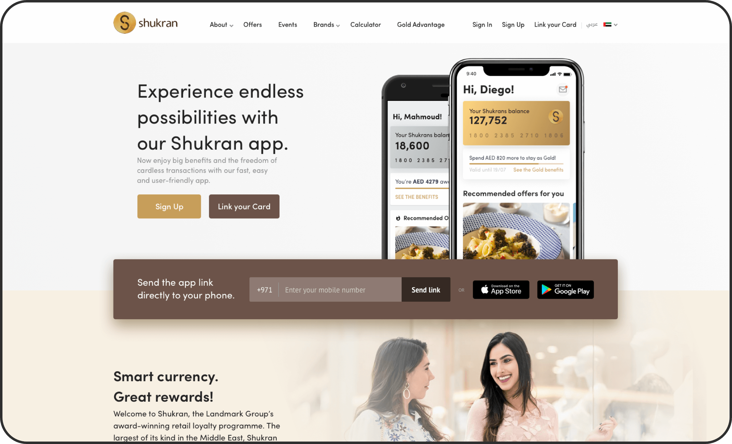
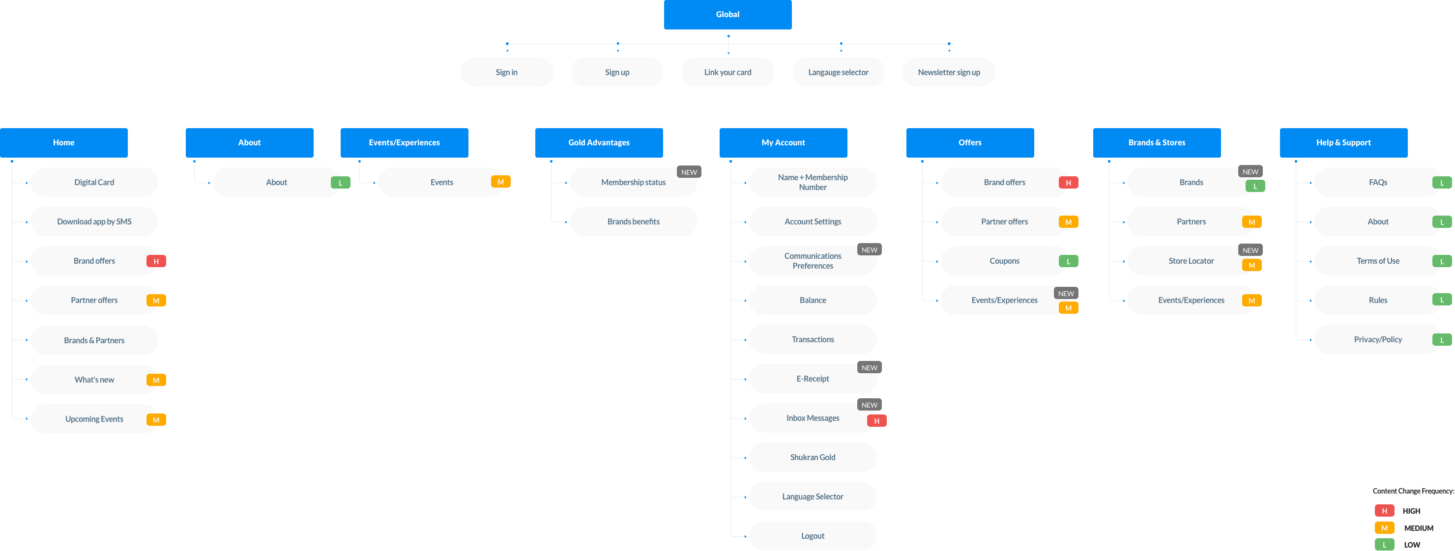
The Shukran 1.0 was available on all platforms (Web, iOS & Android) but the experience was not meeting the basic expectations of the users and with the Shukran 2.0 business wanted to address the following goals:
- Meet Shukran members’ needs on their account (origination and servicing).
- Delivers business and communication objectives of Shukran program.
- Engage, informs and inspire Shukran members.
- Support sales, cross-sell and up-sell of products and commercial initiatives from concepts and participating brands.
- Fulfilling Shukran Members' Needs:
Providing personalized support and service from account creation to ongoing maintenance, including high-level communication on managing Shukran membership accounts, recent purchase history, and self-help resources. - Engaging, Informing, and Inspiring Members:
Creating content and opportunities that captivate Shukran members, provide essential information, and motivate participation, including increased visibility of store locators. - Enhancing Sales through Cross-Sell and Up-Sell Strategies: Supporting sales growth by promoting related products, higher-end options, and collaboration with participating brands in the Shukran program.
- Expanding Partnerships across the Middle East:
Inviting more brands to become partners with Shukran, utilizing the platform to retain customers and promote brand loyalty.
Acheived
Results
Acheived
Results
113% - Organic app downloads lift
83% - Reduced web bounce rate
12% - Reduced call center load by introducing inbox
42% - Logged-in users visiting the New receipts & transactions.
113%
Organic app download lift
83%
Reduced web bounce rate
12%
Reduced call center load by introducing inbox
42%
Logged-in users visiting the New receipts & transactions.
Foundation
Foundation
Mobile applications, particularly iOS, were at the forefront of the project, guiding the overall direction. However, desktop platforms presented unique fundamental requirements that necessitated special attention.
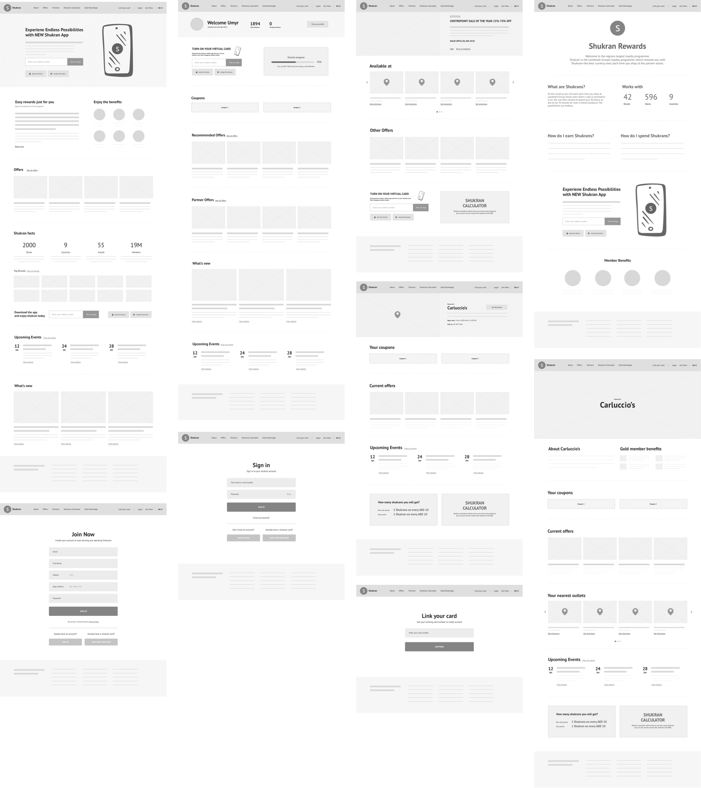
The initial wireframes you see here marked the beginning stages of the desktop site design. Numerous changes were made as I transitioned into the design phase, which you'll notice as you continue to scroll down.
Apps are our first priority, iOS was leading the whole project but for desktop, there is always some fundamental requirement that needs special treatment. These wireframes were the very initial steps of a desktop site. There were lots of changes I made moving towards design phase, you will see while you scroll down.
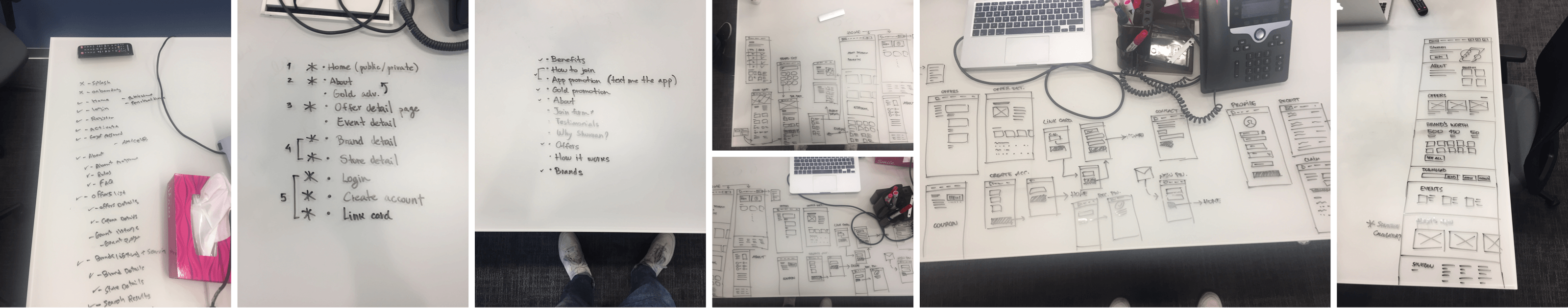
Wireframes
Wireframes
I transformed the initial low-fidelity sketches into more solid forms, refining each section step by step. This process involved determining the optimal flow of content and the best placement of information across various pages.
With desktop design, there's more space available, and if utilized wisely, it can effectively guide users. The goals for the Shukran website perfectly aligned with my approach, as the primary objectives were to encourage customers to download the app and to provide comprehensive information about Shukran and its partners.
Took the Lo-fi sketches to a solid form and step by step I was improving each section like what content should follow what? what information would be best for which page? and so on …
In desktop, you get more space to guide your users (if you use it smartly). The goal of the Shukran website and the purpose (nowadays) desktop sites serve, was a good match for me because of all we wanted from desktop site to push customers to download the app and to give information about Shukran and it’s partners as much we can.
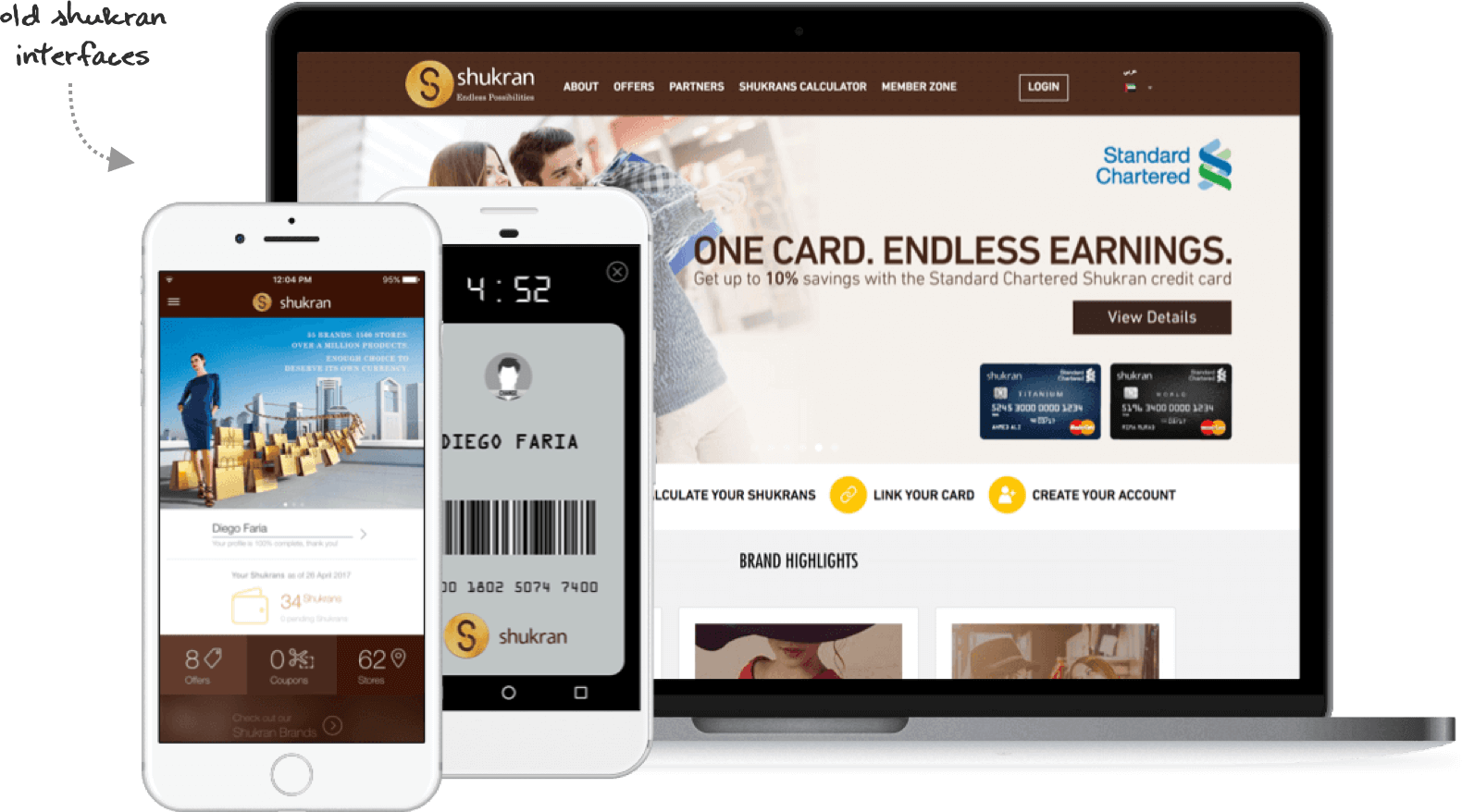
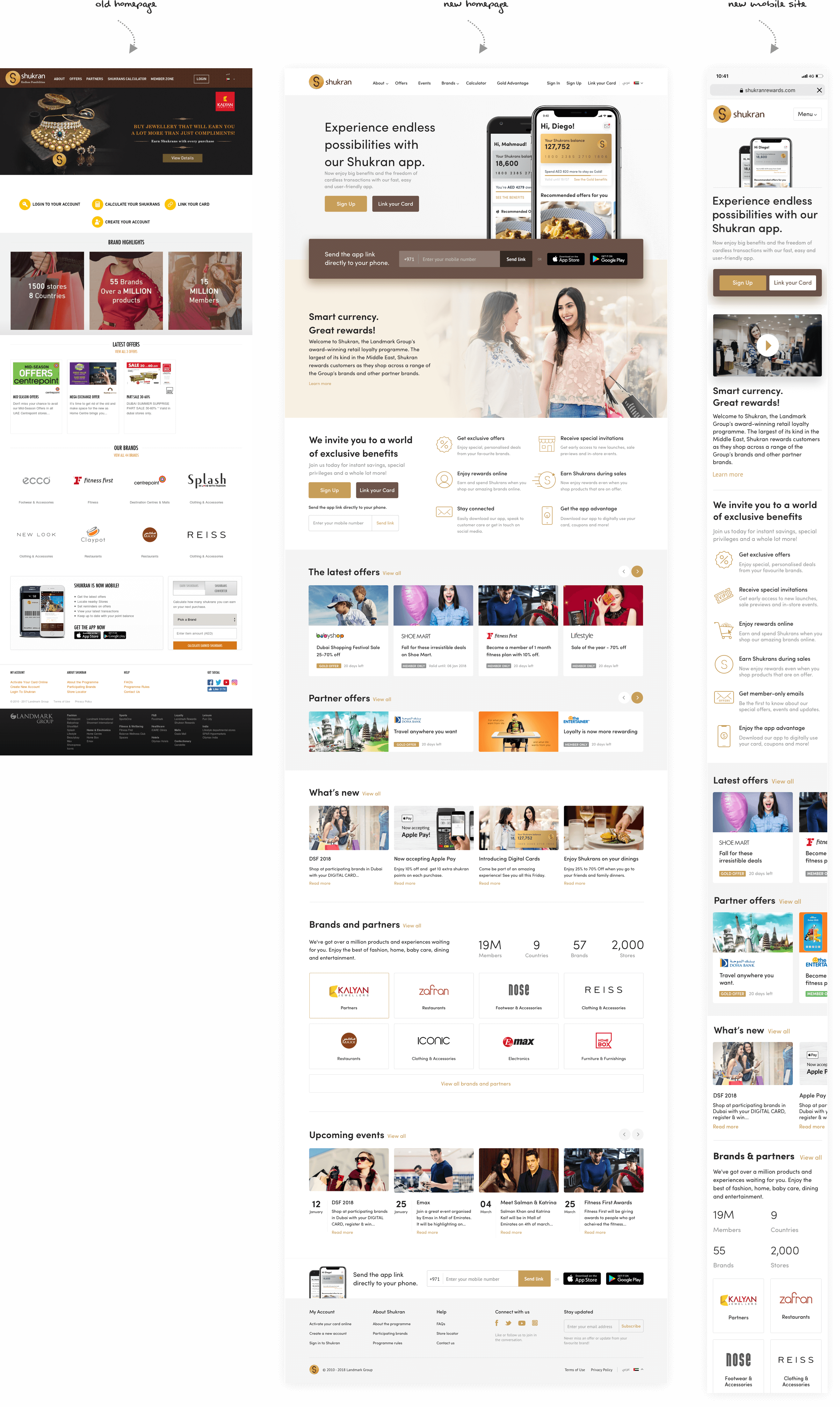
Was & Now
Highlights of the project
Highlights
of the project
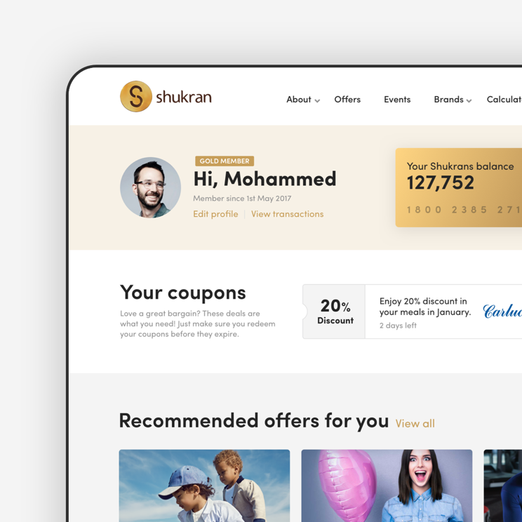
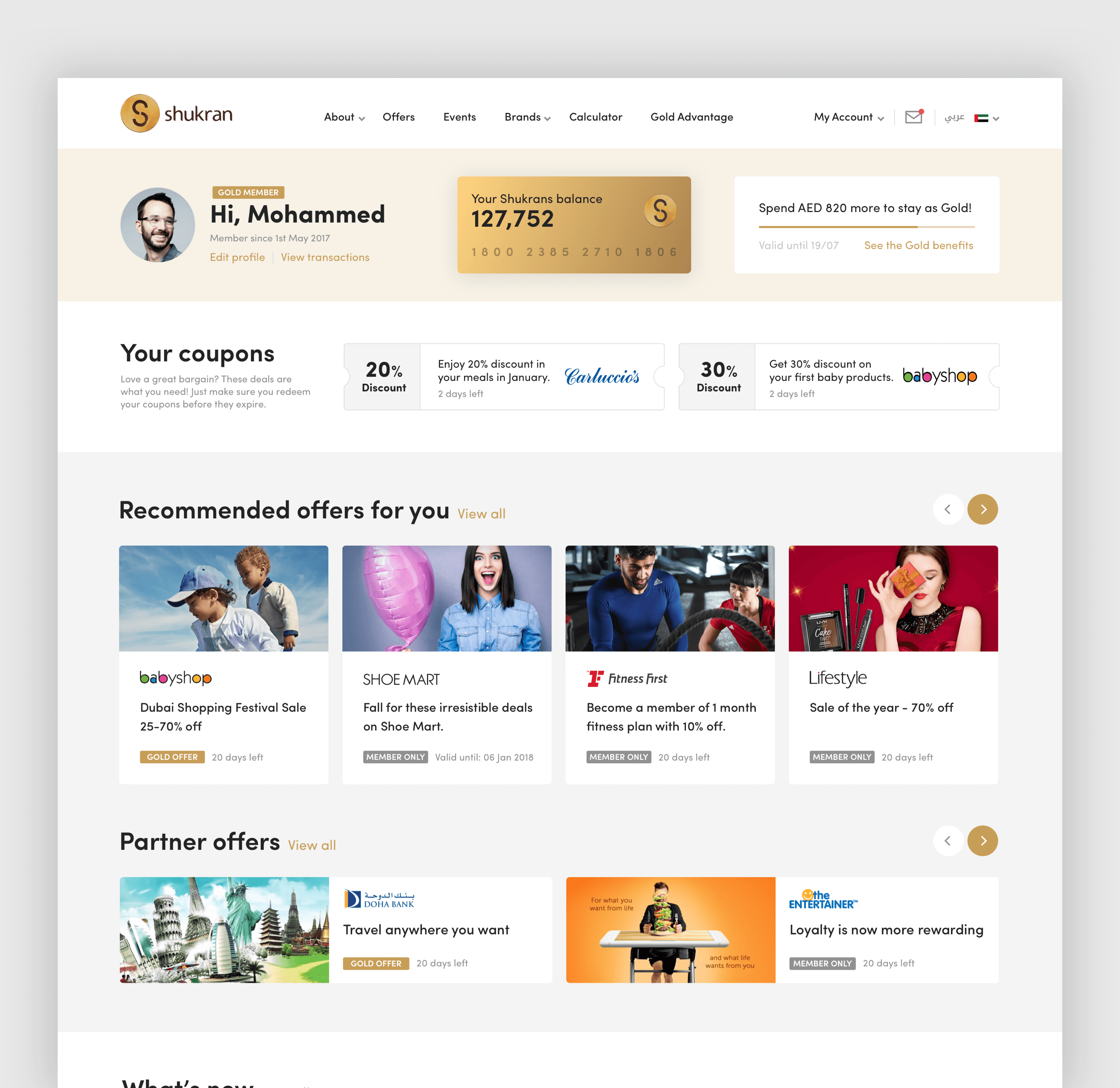
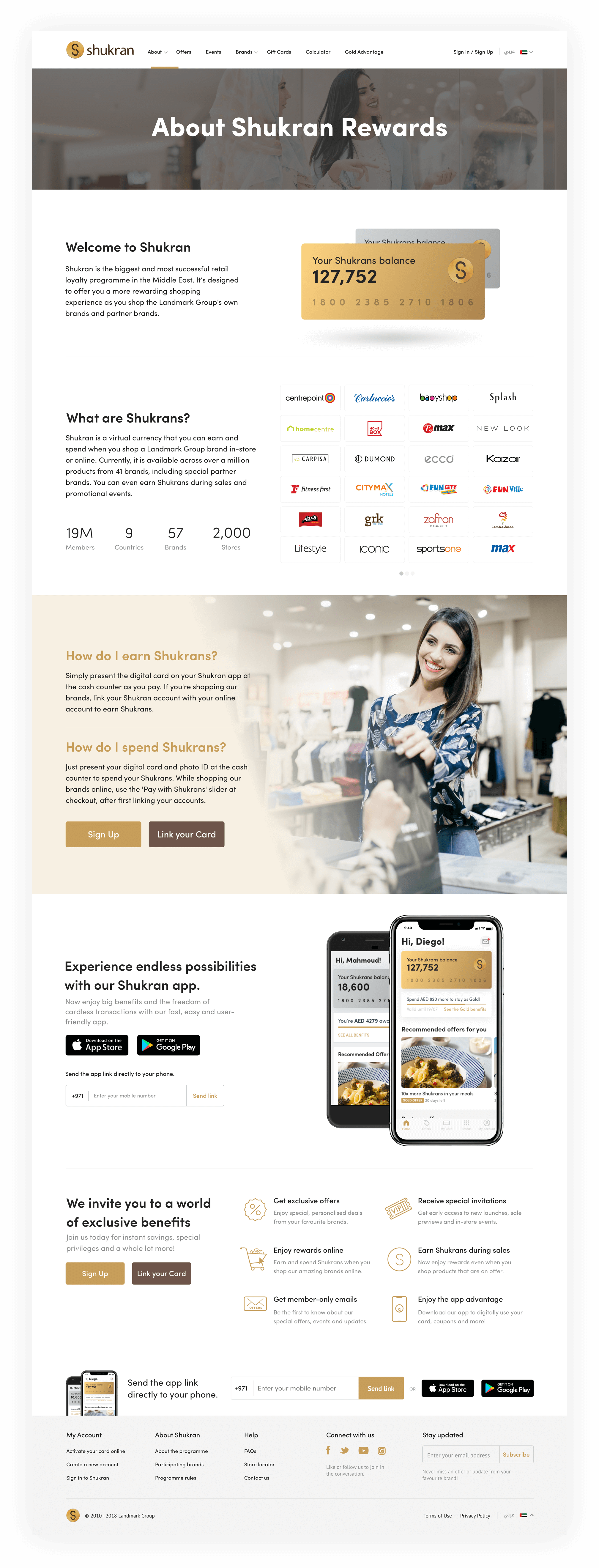
Digitization of Shukran Card
Digitization of Shukran Card
This is 2019, and finally, Shukran has decided to stop using physical cards for rewards, which they'd been doing for 8 years. Instead, they switched to a digital system. This change was good for both the company and the users, and it's easy to see why
For 8 years Shukran was using the physical card to reward users. It's 2019 now and finally, they decided to kill the physical cards and go digital. I don't need to explain what benefits this step has given to users and the company, quite obvious! isn’t it?!
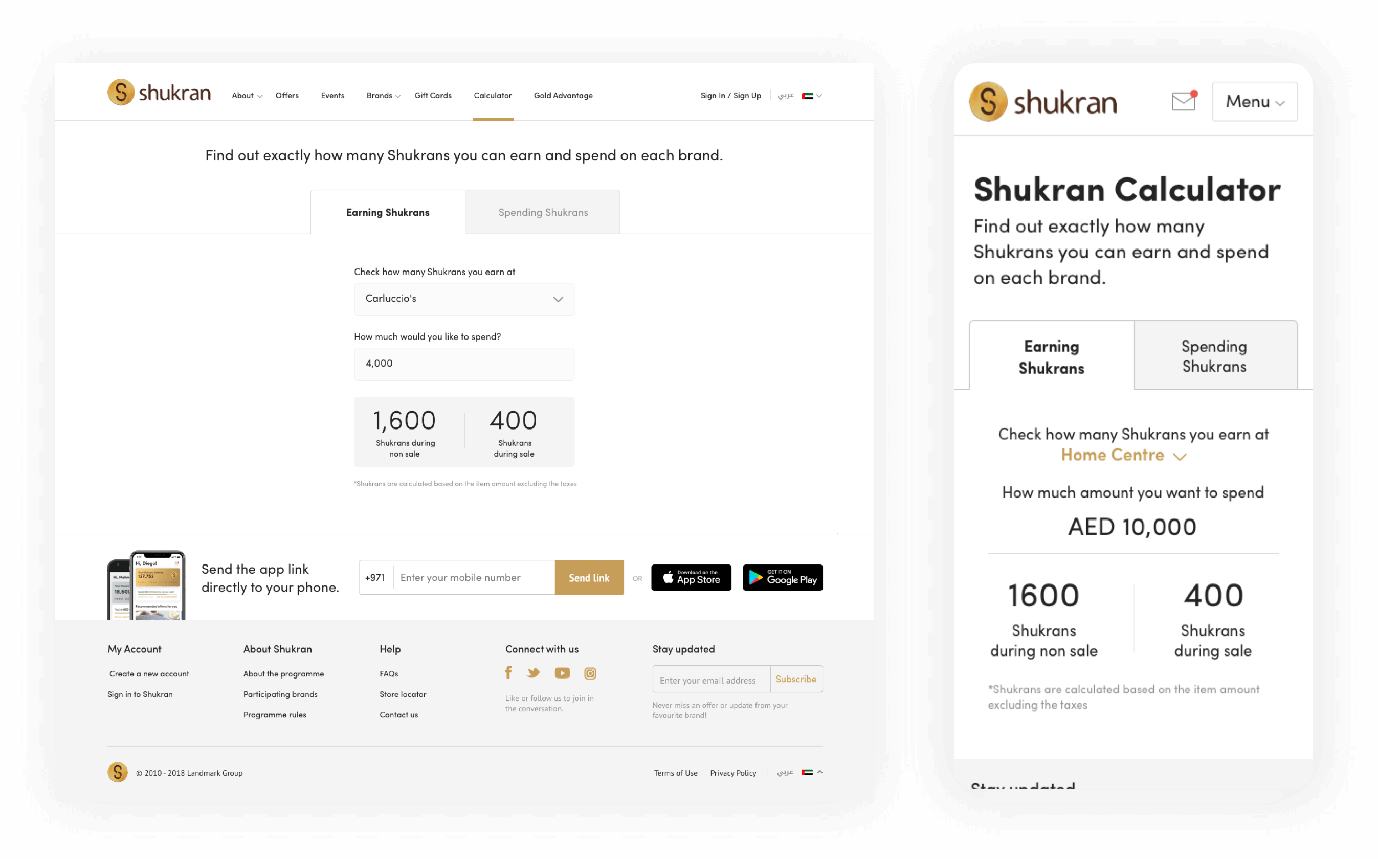
Improved Shukran Calculator
Improved Shukran Calculator
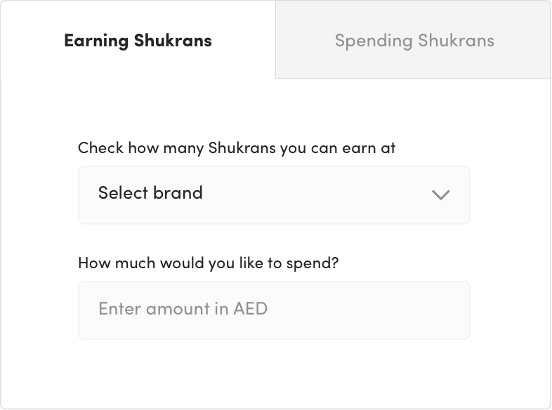
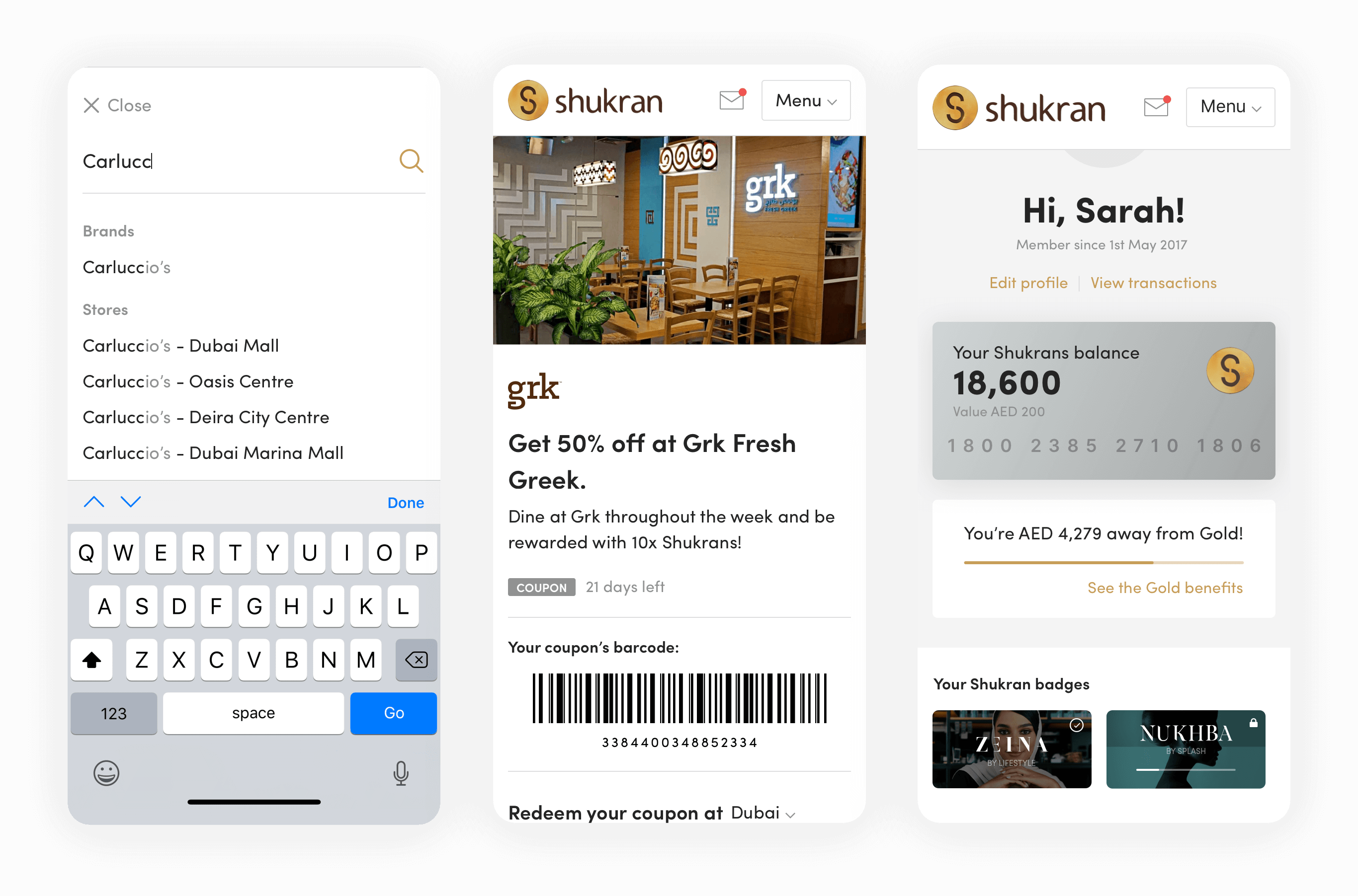
I simplified the usage of the Shukran calculator by separating the earning and spending into 2 separate tabs and also exposing it to the main navigation. With over 55 brands collaborating with Shukran, each offering a unique value, the new calculator facilitates users in computing the values they earn or spend by brand. This tool aids customers in making informed decisions about where to allocate their money.
I designed a better calculator for desktop and mobile sites to measure Shukran's earnings and spendings easily. Shukran serves more than 55 brands and each brand gives a different value to Shukran. Based on your transaction new calculator allows you to calculate the values you earn/spend by brand. Which helps users to decide where they should spend their money.
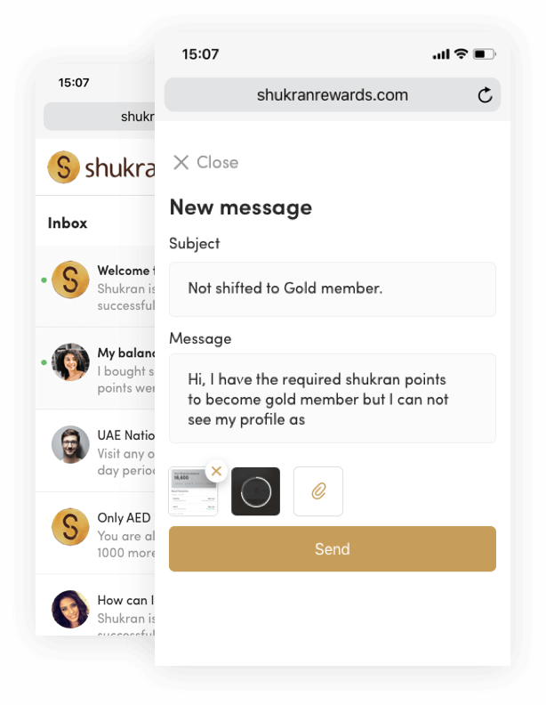
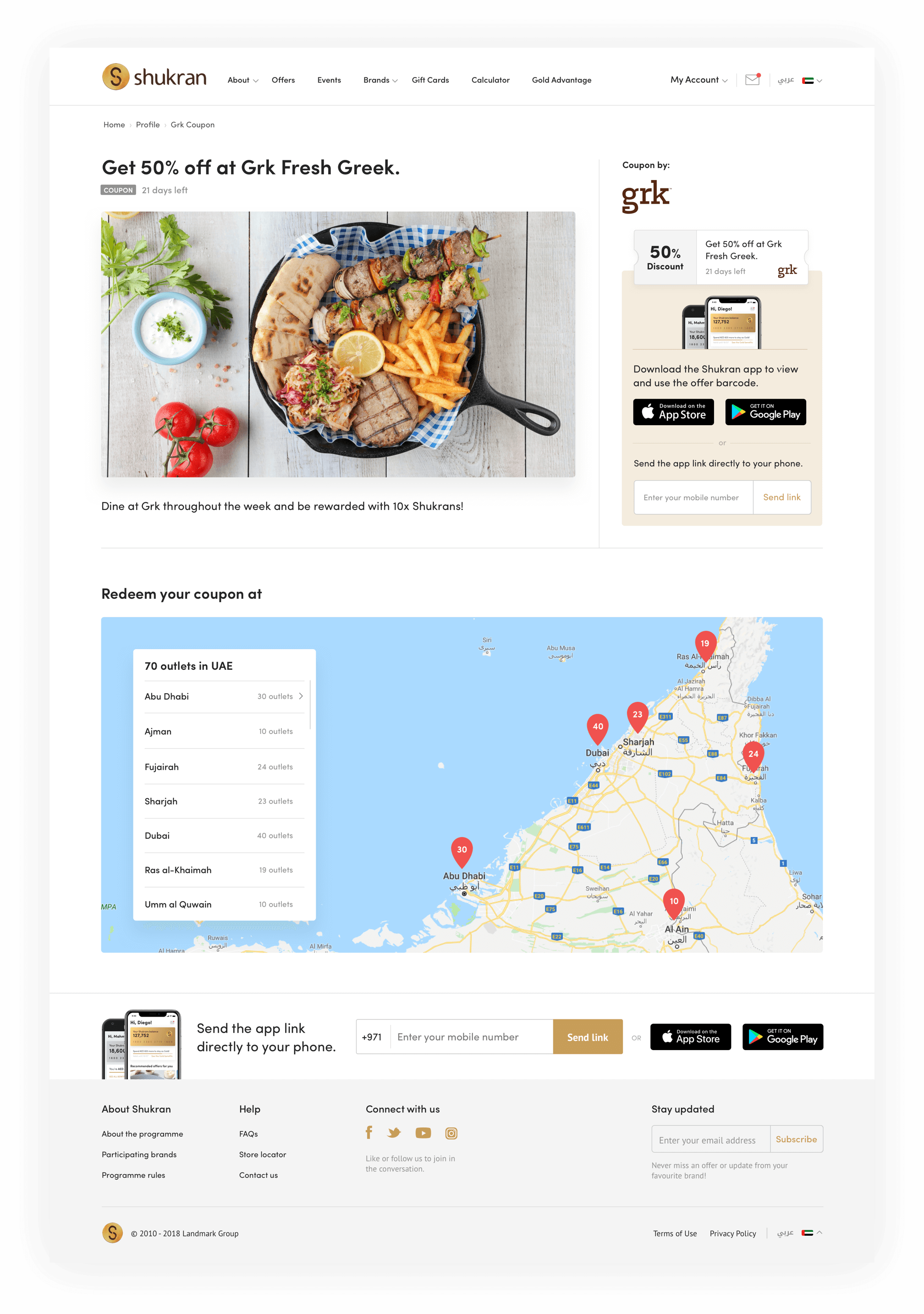
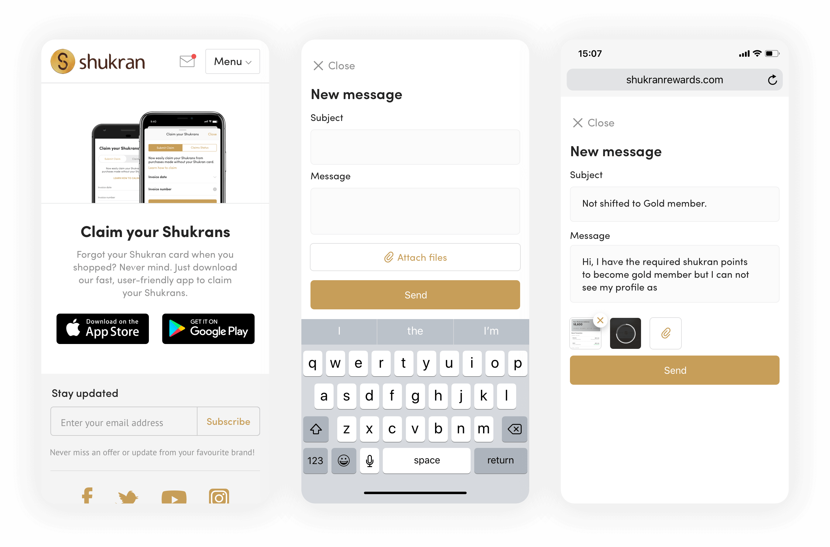
Inbox
Inbox
The goal was to lessen the burden on the call center by reducing the volume of phone calls. By incorporating an Inbox feature into Shukran, members can now easily track all aspects of their Shukran membership, including issues, notifications, earnings, and spending. This addition has streamlined communication and provided a more comprehensive overview of individual membership details.
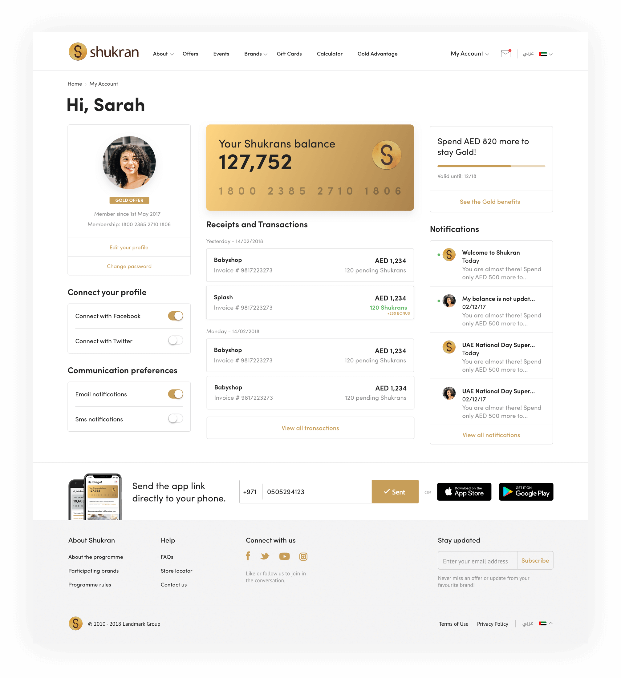
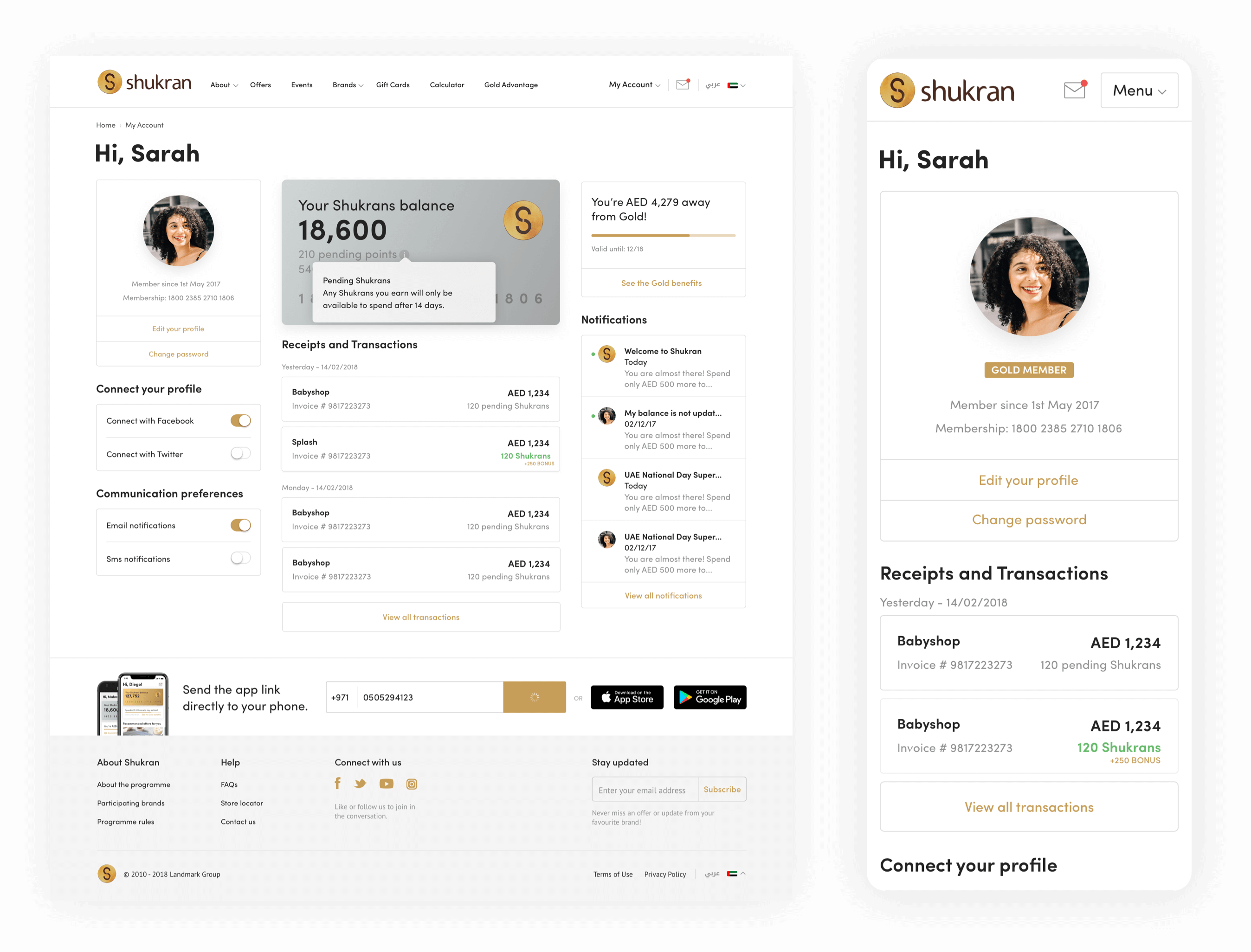
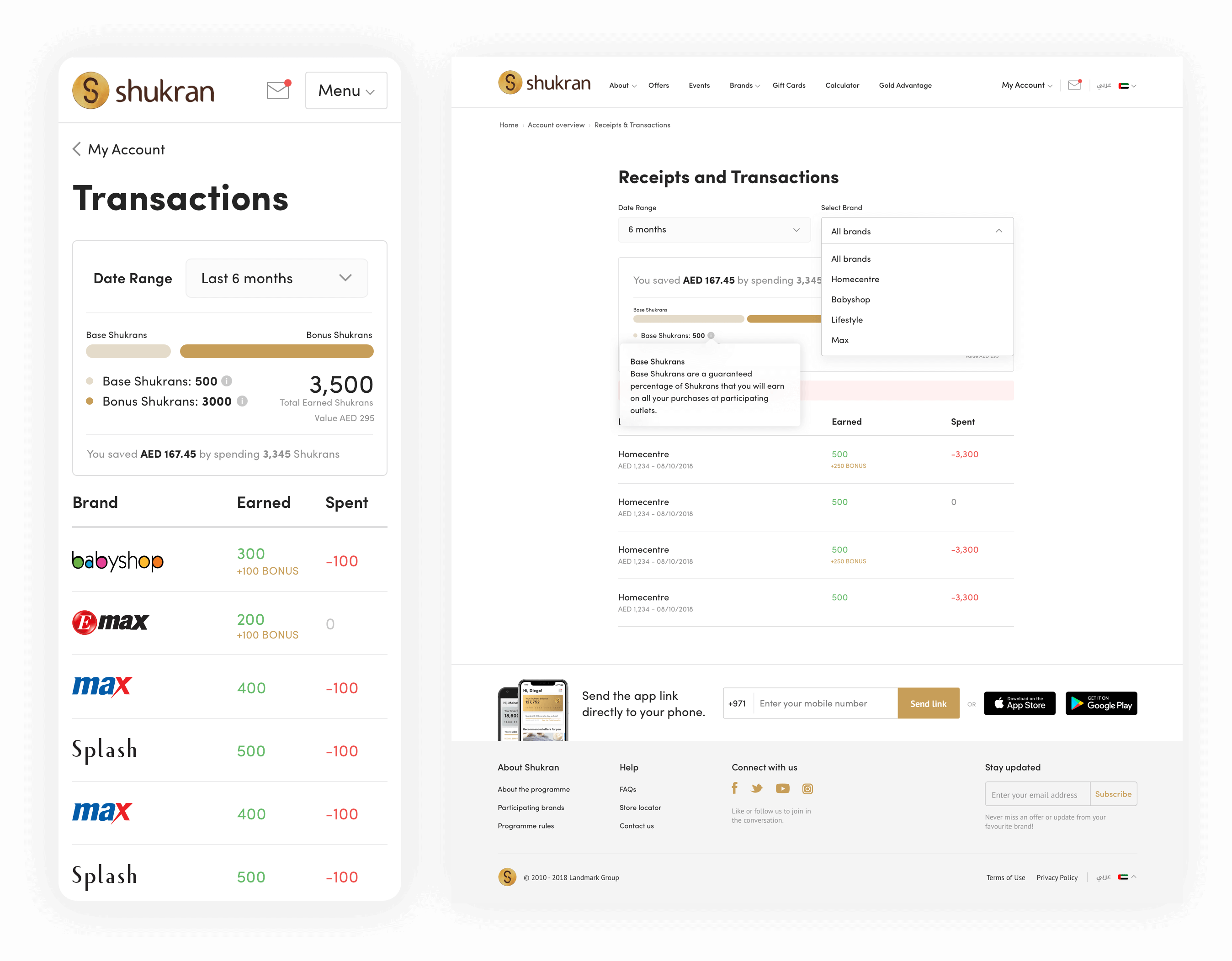
Receipts & Transactions
Receipts & Transactions
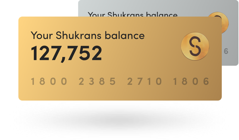
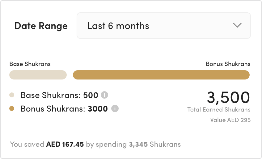
The updated Shukran platform now includes a visual account statement of members' spending on Shukran-affiliated brands. By combining graphics with text, the transactional statement is designed to quickly convey information. Users can monitor their transactions and see the value of Shukran points earned from different brands, tracking up to a year or more. This feature not only enhances user understanding but also has practical, everyday applications – even my wife finds it incredibly useful!
The new Shukran has an account statement of members spendings on Shukran brands. Graphics with text helps to understand things fast. I designed the transactional statement in visuals. Users can keep track of their transactions and what value of Shukran they have earned from different brands. It allows users to track more than 12 months. It's really helpful, my wife uses it a lot. haha!
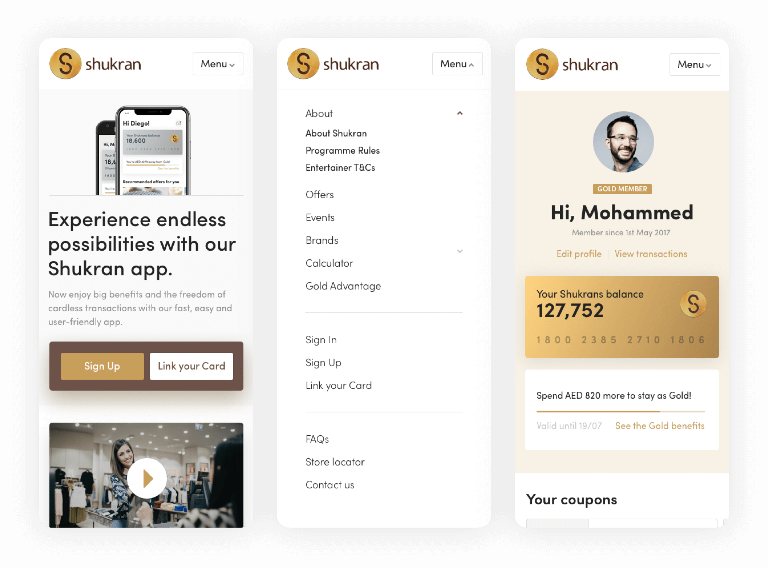
Increase App Downloads
Boost App Downloads
Promoting the Shukran app was a significant goal in designing the site's homepage. Recognizing that the main platform for Shukran is its mobile applications, I wanted to emphasize the importance of downloading the app. Rather than just placing download buttons for iOS and Android in the footer, I strategically included three distinct spots on the homepage to remind users to download the Shukran app. This approach aligned with Shukran's requirements and amplified the call to action.
This is one of the most important goals of any online business. While designing the first page of Shukran I wanted to be loud about downloading the app. There were 3 spots on the homepage where I proposed to remind the user to download Shukran app.
Shukran's main platform is mobile applications. Shukran’s requirement from the and therefore we clearly needed something more than just placing the iOS/android store buttons in the footer.

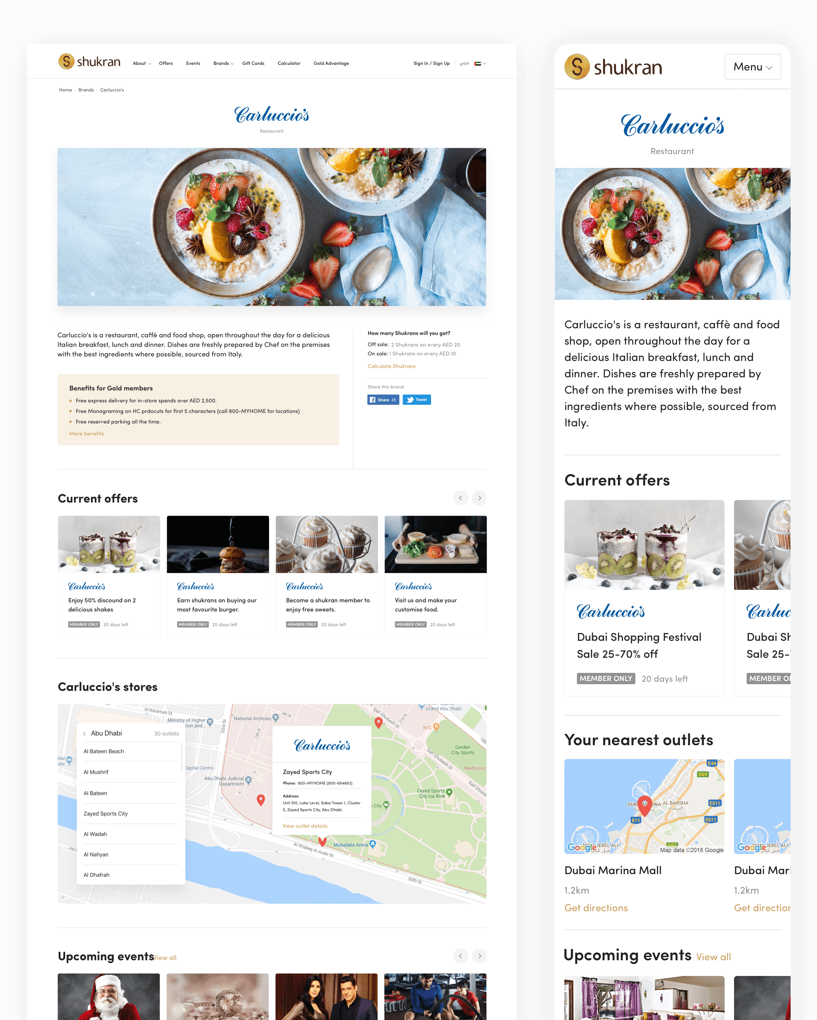
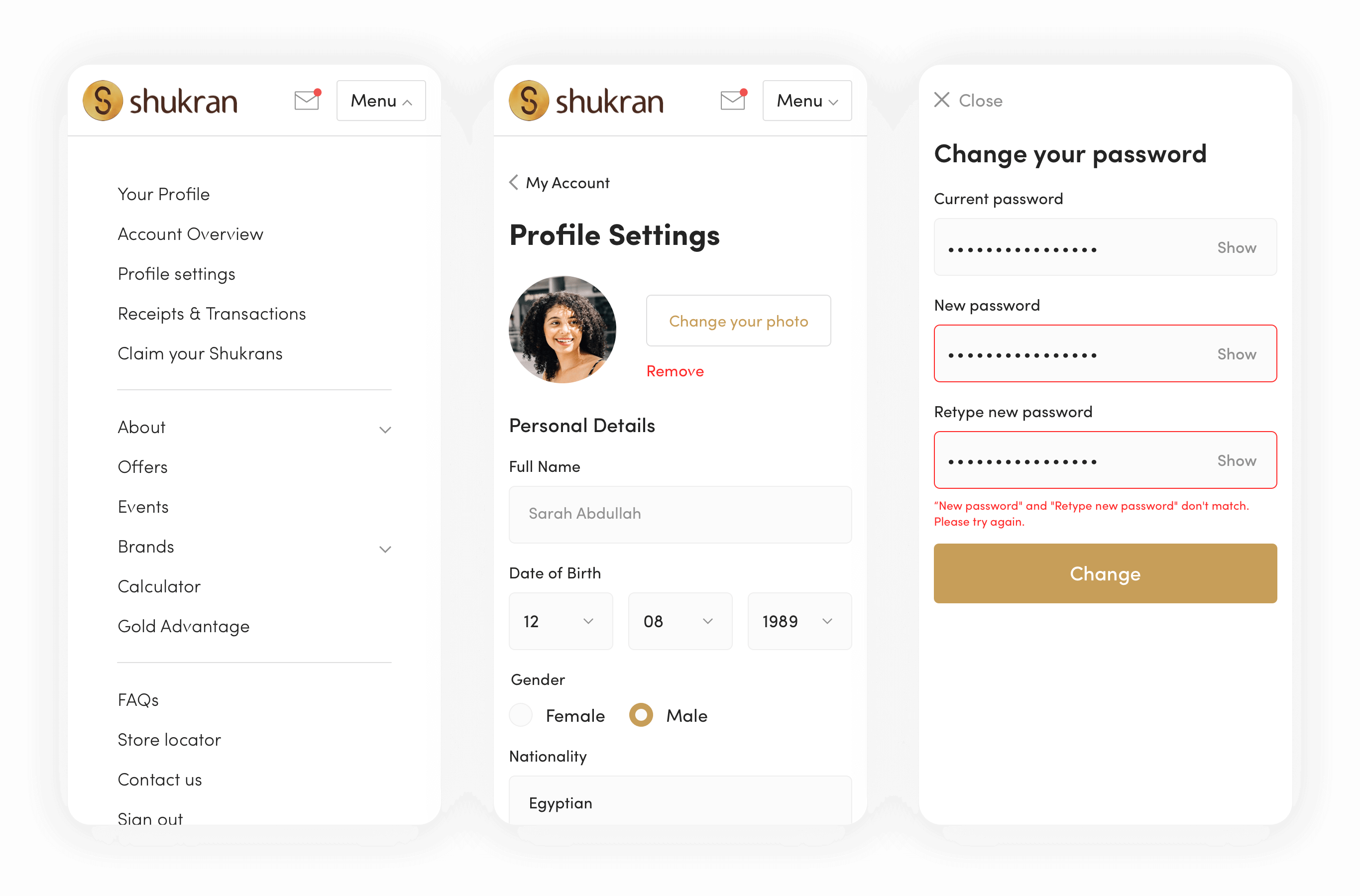
User Interfaces
User Interfaces
170+ Screens! Obviously can't list them all.
170+ Screens! Obviously can't list them all.
Upon receiving approval, I immediately began translating the wireframes into Shukran's new visual style. This project required simultaneous attention to both UX and UI, not just dressing up the wireframes. Due to time constraints, I quickly transitioned into the UI phase after covering only the essential pages needed for approval.
During this process, many new ideas emerged, particularly regarding the Shukran Calculator, Store Locator, Account Dashboard, Coupons, and Offer detail pages. Various solutions were explored and refined in team meetings.
It's worth noting that we completely changed the Visual Style Tile in this case study, transitioning from a skeuomorphic design to a more modern approach. Although I have not presented the tile here, you can get a sense of the transformation by viewing some of the screens below or browsing the website, or even becoming a member of Shukran (if you are in the Middle East).
After getting the approval my next step was to nicely dress up the wireframes into the new Shukran visual style, but it was not just the UI design, I had to work parallel on UX and UI in this project. Wireframe phase-only covered a few major pages that were needed for the approved purpose and due to the shortage of time, I had to jump directly into the UI phase.
As in combination with UX&UI many new things were coming up. I tried a lot of solutions for Shukran Calculator, Store Locator, Account Dashboard, Coupons and Offer detail pages, etc and all of those were being filtered in each team meetup.
By the way, I have not presented the Visual Style Tile in this case study but we (design team) changed it all, just so you know the transformation was from skeuomorphic to modern design.
I am presenting a few screens below. You can browse the site here www.shukran.com
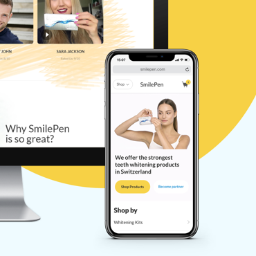
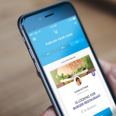
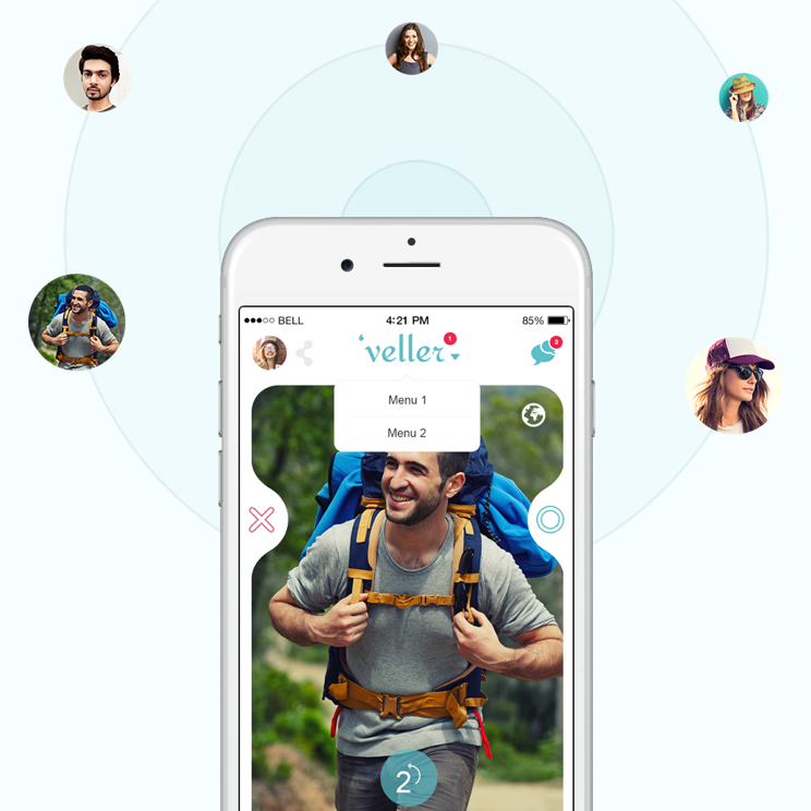
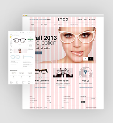
Other Projects
Other Projects