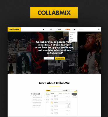
An app that was designed for 7 brands owned by Landmark Group. The goal for the app was to have one uniform journey that can help 7 brands to give a customized experience to their users. I and a co-designer (Diego Faria) collaborated on the project. The whole project took 3 months.
The aim was to launch the iPad app with almost all the features we had for other platforms so we could deliver a similar experience on all platforms (Apps, Desktop, and Mobile). We designed each and every use case thinking of the iPad user experience. It took us 3 months to complete the project and we ended up designing 300+ screens.
An app that was designed for 7 brands owned by Landmark Group. It was the 2nd iPad app I designed but I consider it first because of its scope and scale. I worked as Co-designer with a great designer (and a friend) Diego Faria. We had our own territories to work on. The whole project took both of us 3 months to complete the design, we nearly touched each and every possible use case and designed 300+ screens for the app.

Challenge
All 7 brands had their own specific business requirements. The requirement was to follow the new iOS 11 visual style and design the experience in a way that covers the navigation structure of existing iOS apps. Also, to design one architecture that can work with the needs of 7 brands and also gives access to customers to shop across 7 brands and checkout from any of them.
My Role
I took care of the Discovery experience (home screen, Inspirational departments & category product listings ), User Account, and Basket (that's what I am presenting in this case study).
My role was to design the UX (department navigation structure, products exploration, and filtration) and UI (Aesthetics that can work for 7 brands). In addition, I worked on the interactions for stakeholders to understand experience clearly which later on helped a lot to communicate with the developers.
Master of all
Splash was chosen to lead iPad app design from the management and then I created the needful cases for each brand (wherever they required).
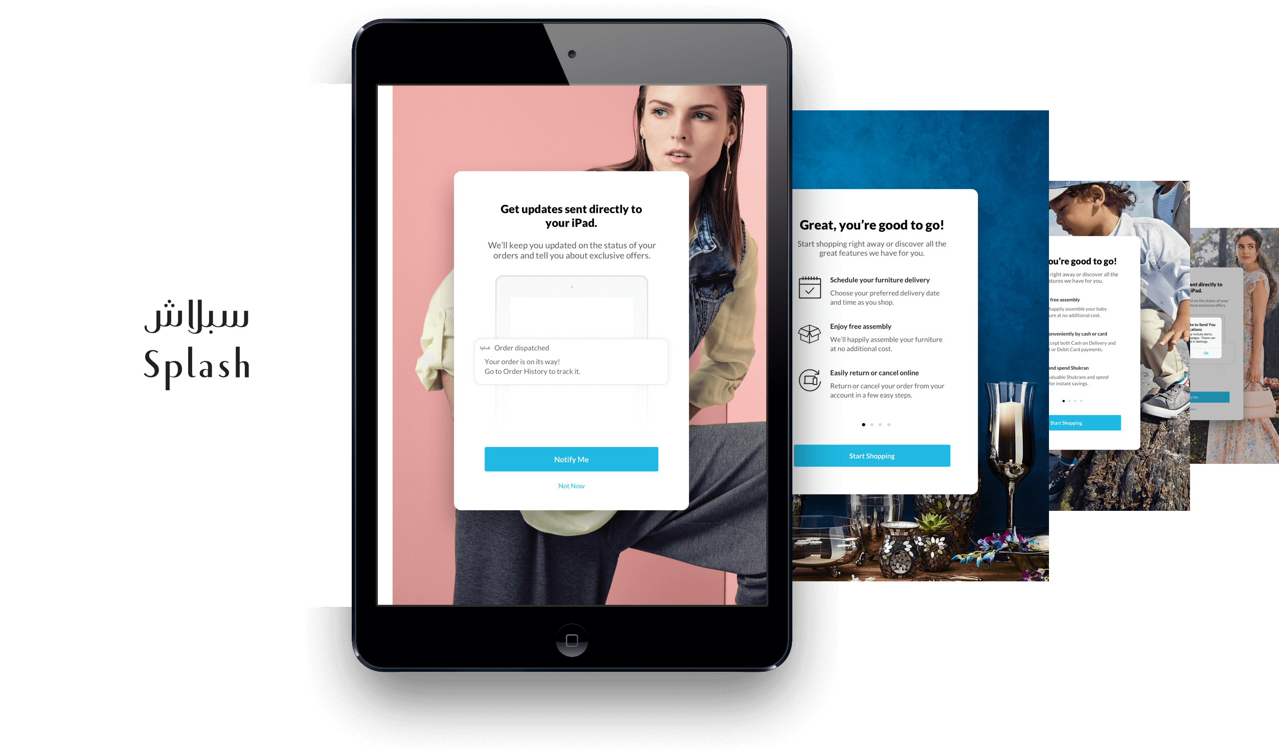
Onboarding
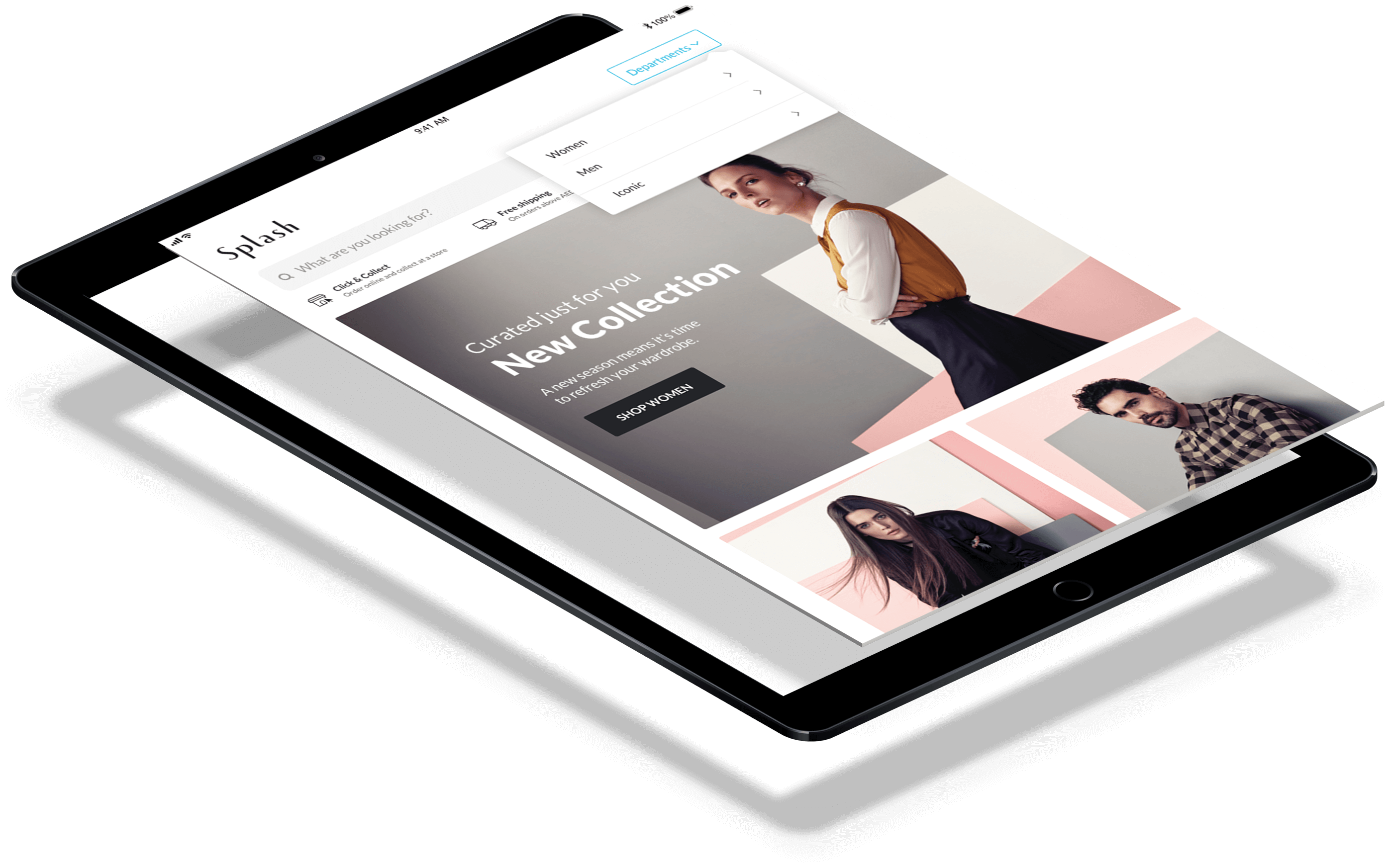
One app for 7 brands, but still each of them needed their own identity. I came up with this idea to have business-specific backgrounds for each brand that can differentiate among brands as soon a user opens our apps and at the same time, these backgrounds could help the businesses to keep their customers updated with their latest campaigns.
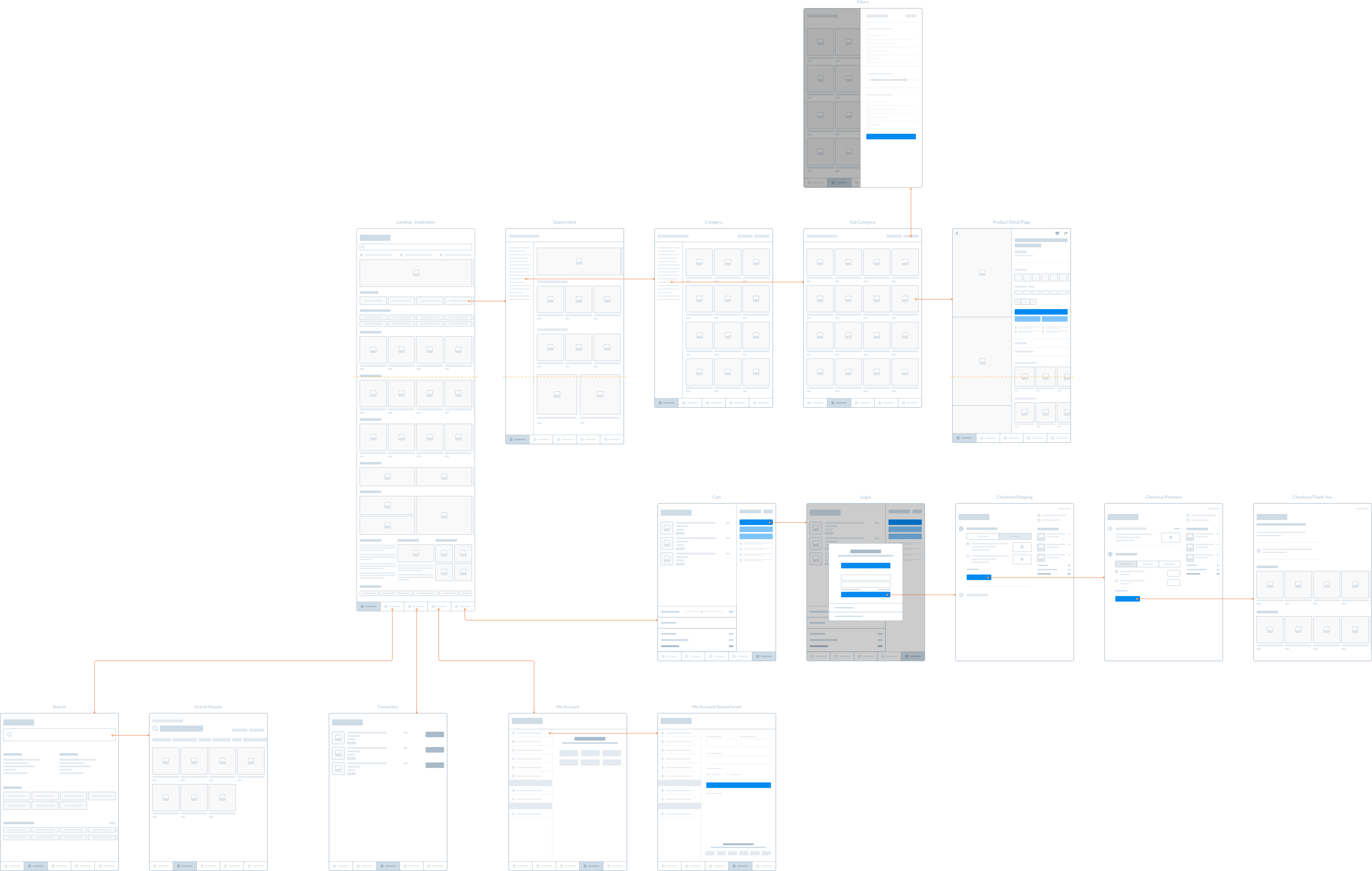
Architecture
We already had pretty much idea of the structure we were going to build because of the existing iOS applications. We created these wireframes to be more clear before jumping into UI Phase.
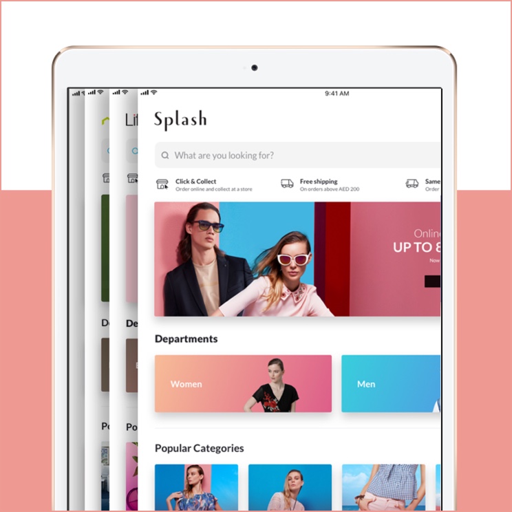
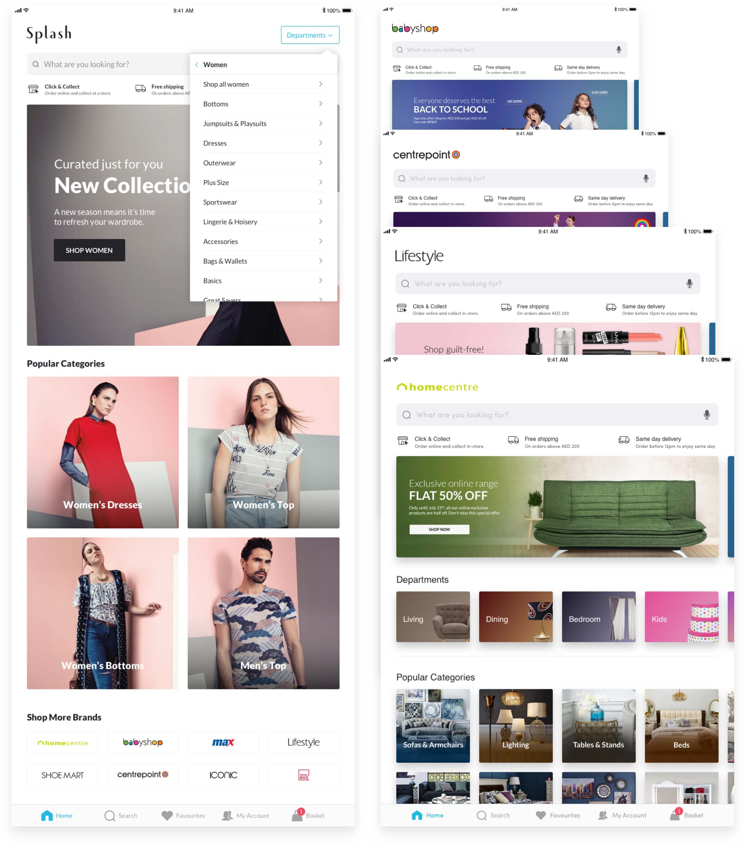
Home Screens
One of the requirements I was not much happy with, was to follow the homepage designs of the Websites for the app homepage. I got the chance to think differently for Splash and I spent some time with it but that discussion didn’t go long. Stakeholders decided to go with a similar layout to other brands.
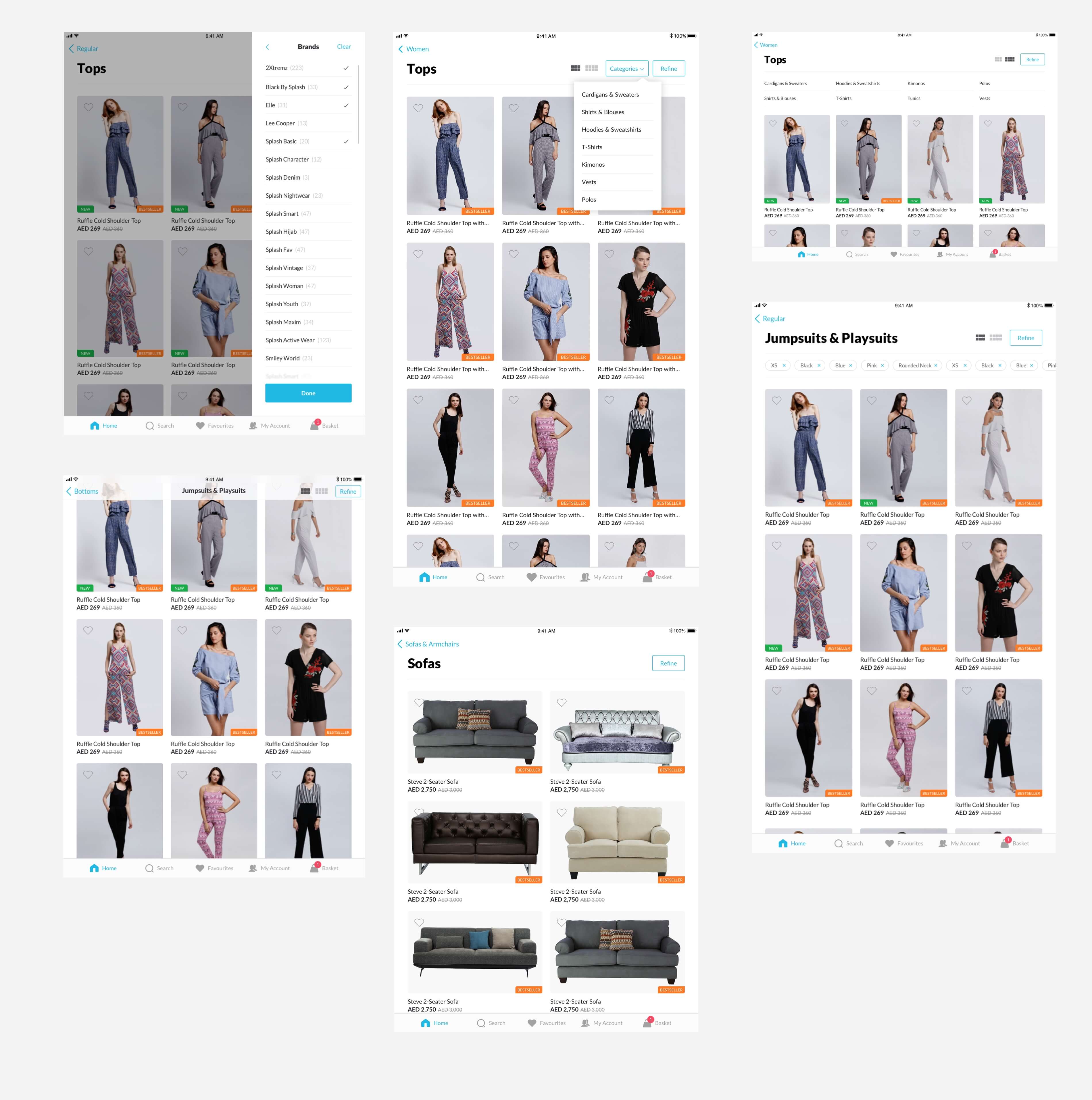
Collection Screens
Collection Screens
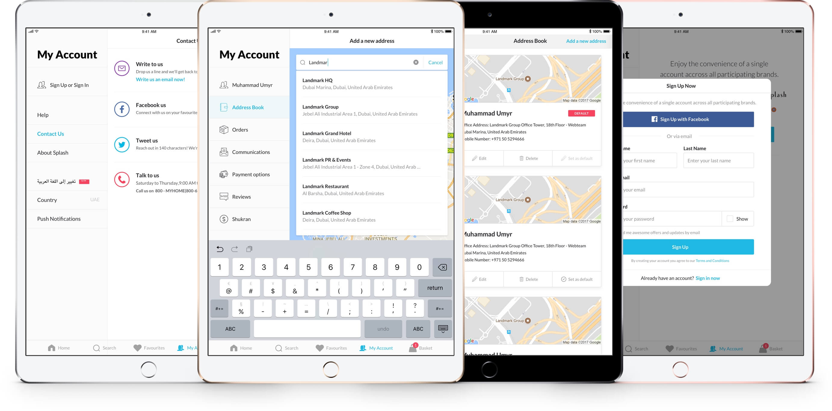
User Account
Worked on 2 interaction approaches with My Account experience, both of them had cons and pros.
User Account
Worked on 2 interaction approaches with My Account experience, both of them had cons and pros.
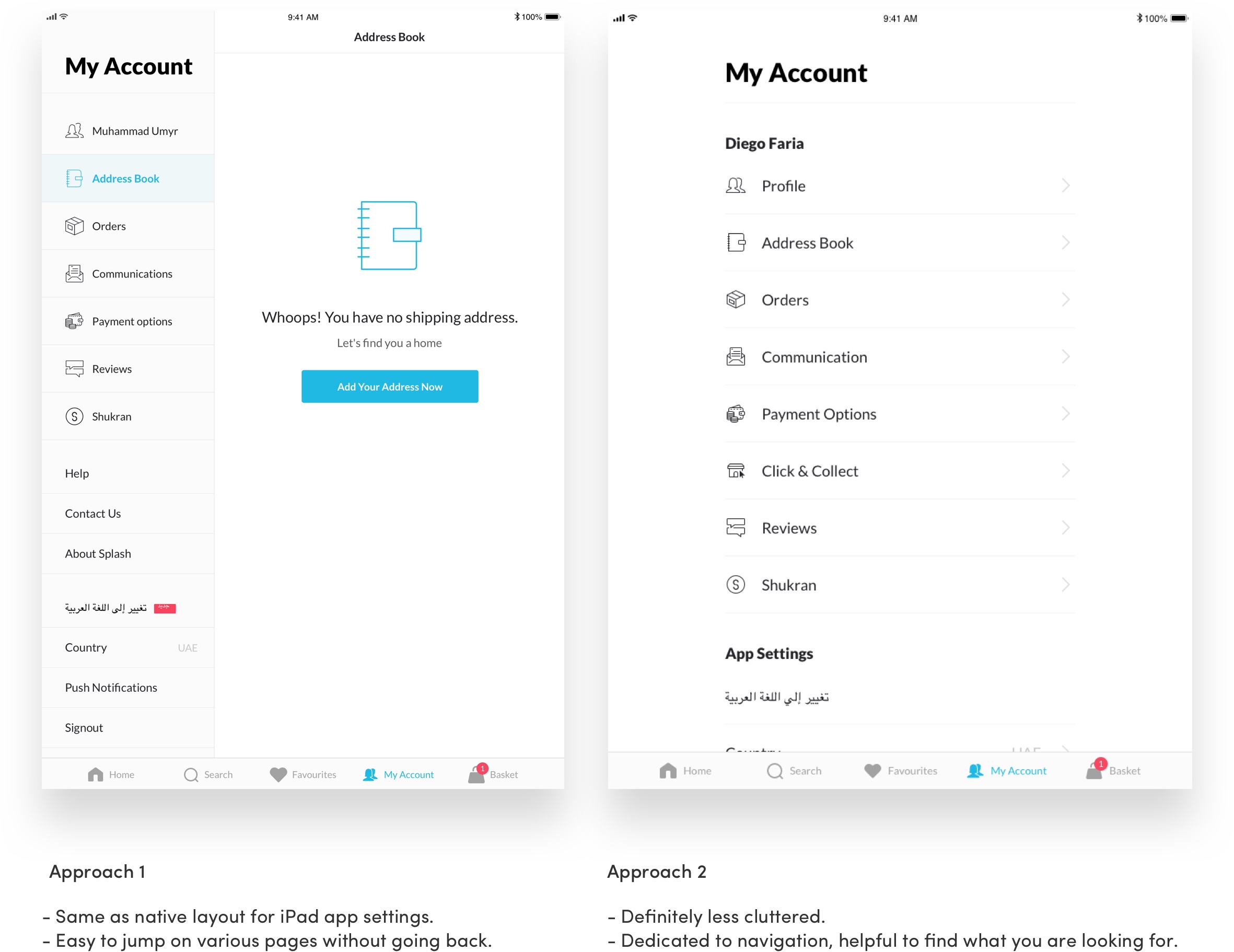
Mocked up few screens with both approaches to be sure on what is best to use.
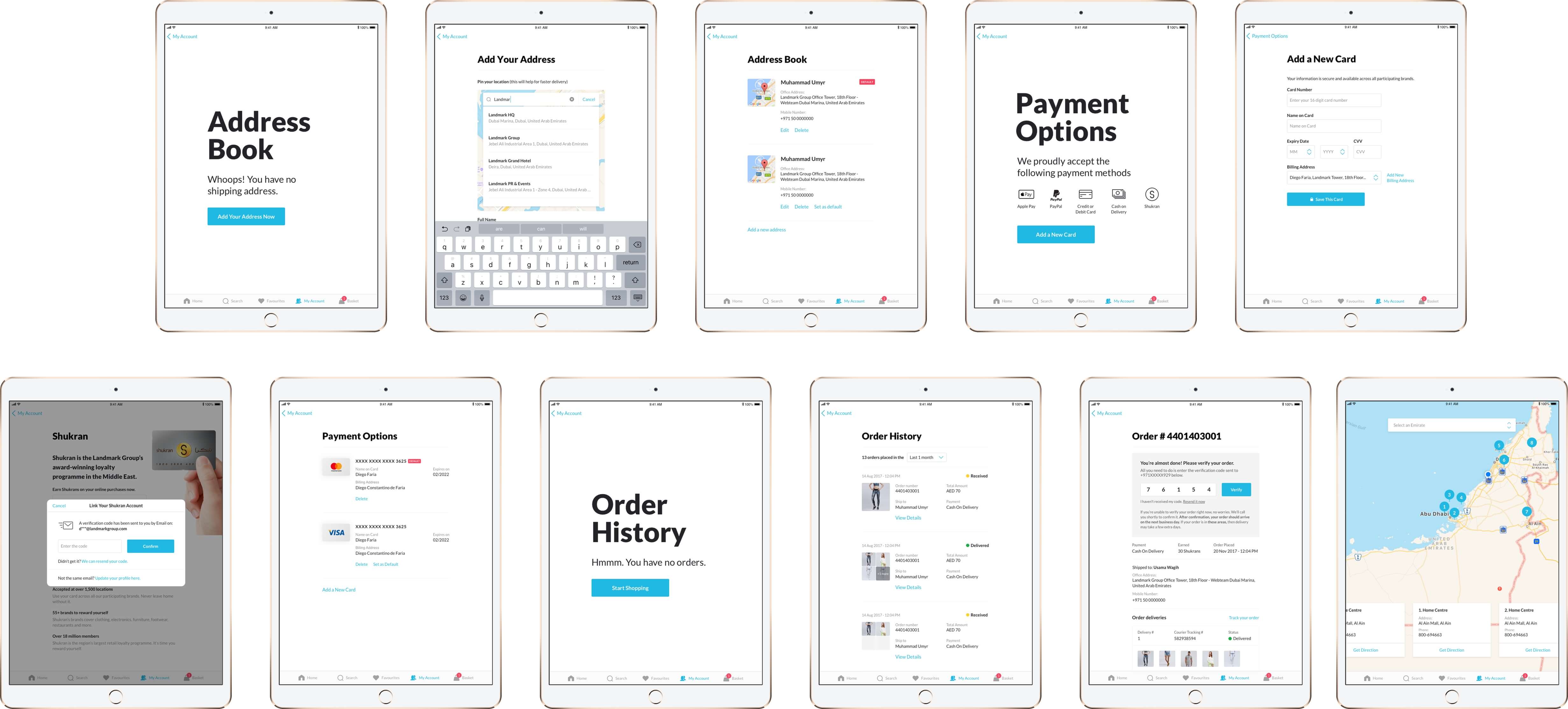
Final Screens for Account
After the internal reviews with management final decision to go with the 2nd approach, they found it more modern, less cluttered, easy to use and the whole screen was dedicated to each action.
Final Screens for Account
After the internal reviews with management final decision to go with the 2nd approach, they found it more modern, less cluttered, easy to use and the whole screen was dedicated to each action.
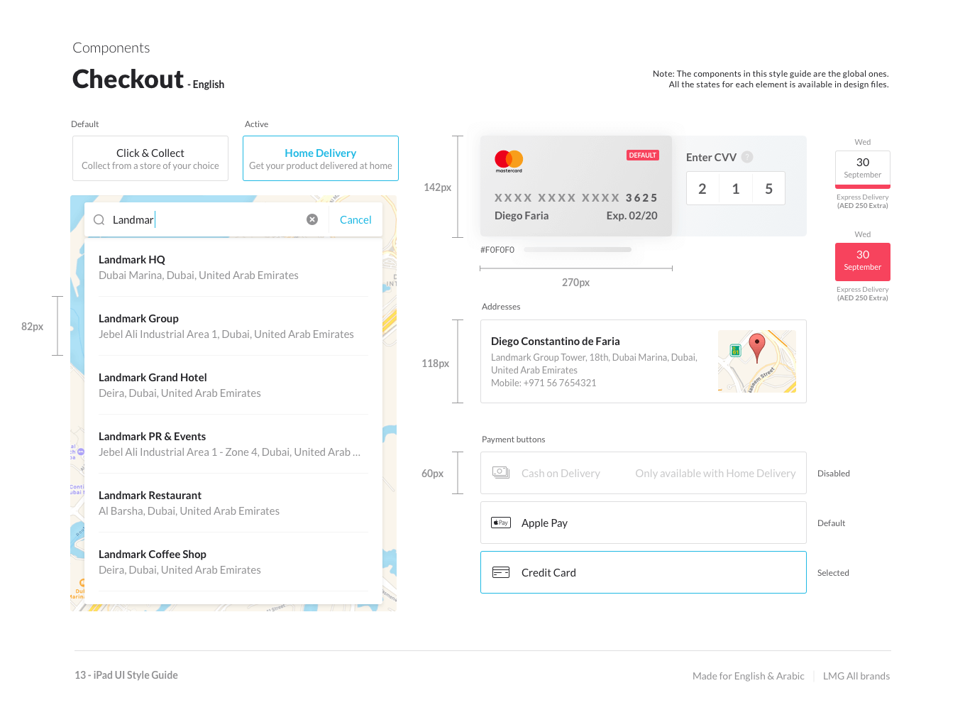
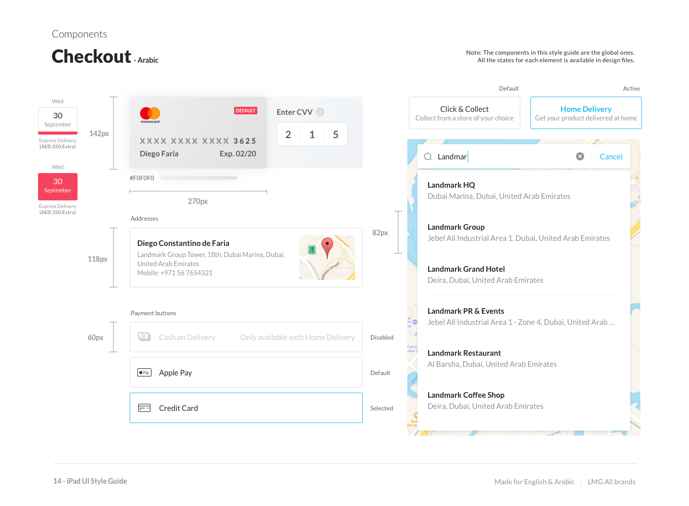
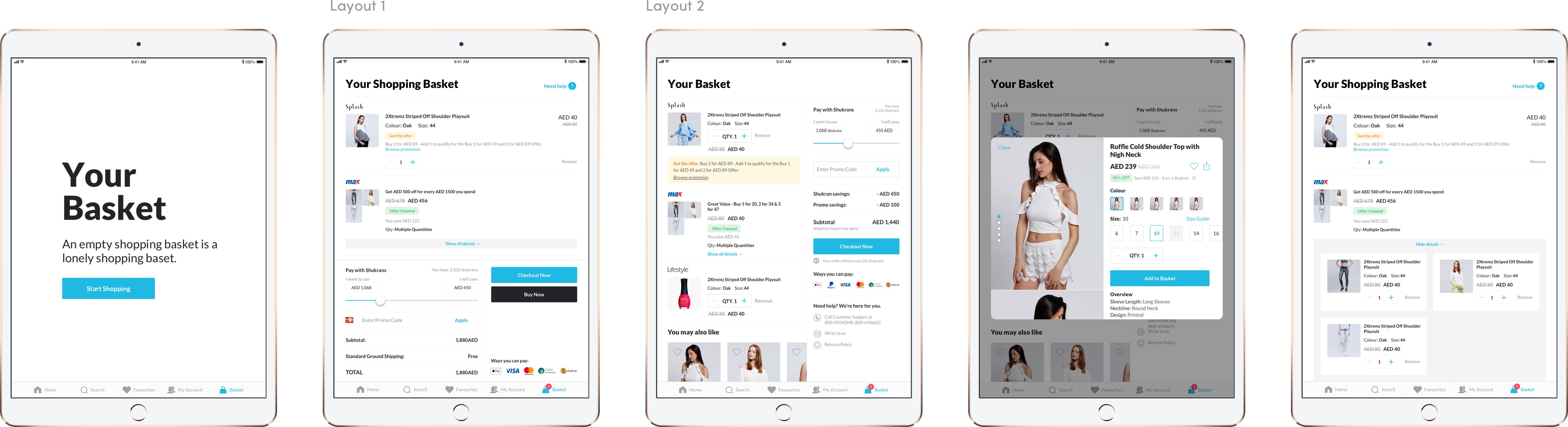
Basket
Designing the Basket experience was fun. It has lots of different use cases in it and the challenge was to design the screen less cluttered as much as possible. I designed the "Layout 1" it helped to reduce the cluttered but brands wanted to keep the basket layout consistent with the website so we finalized the "Layout 2".
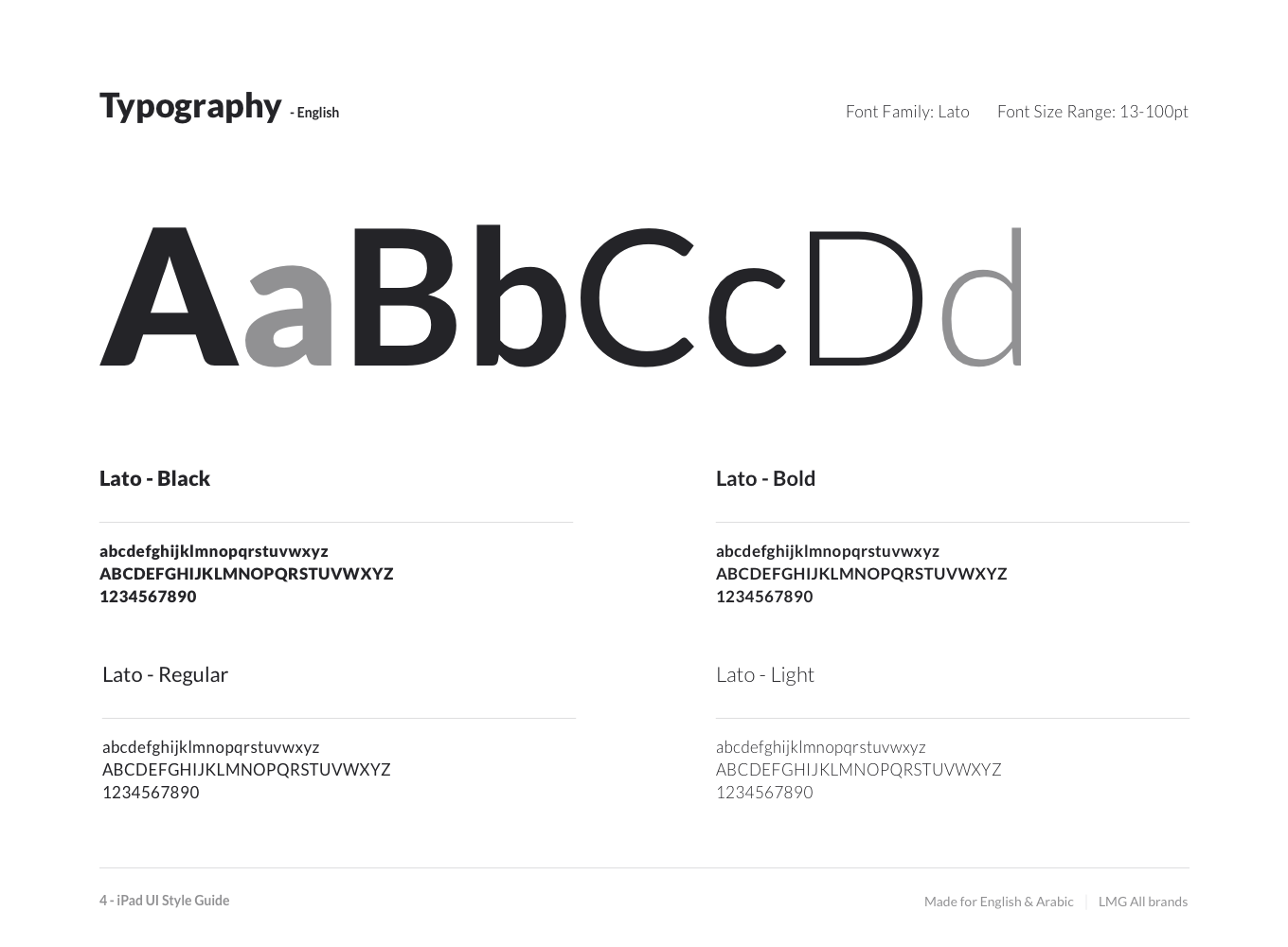
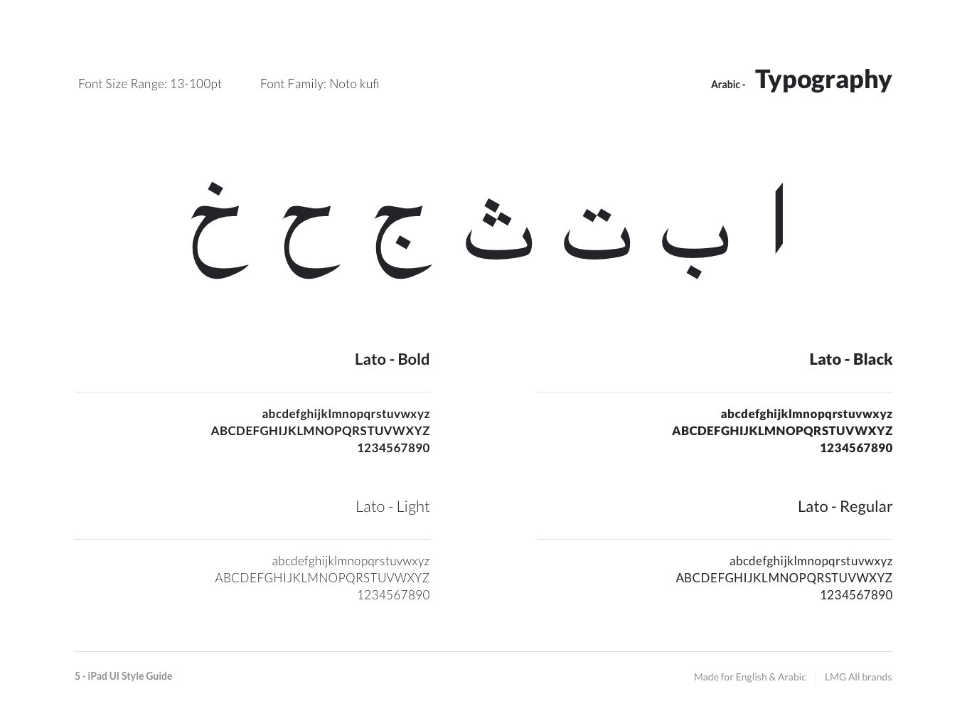
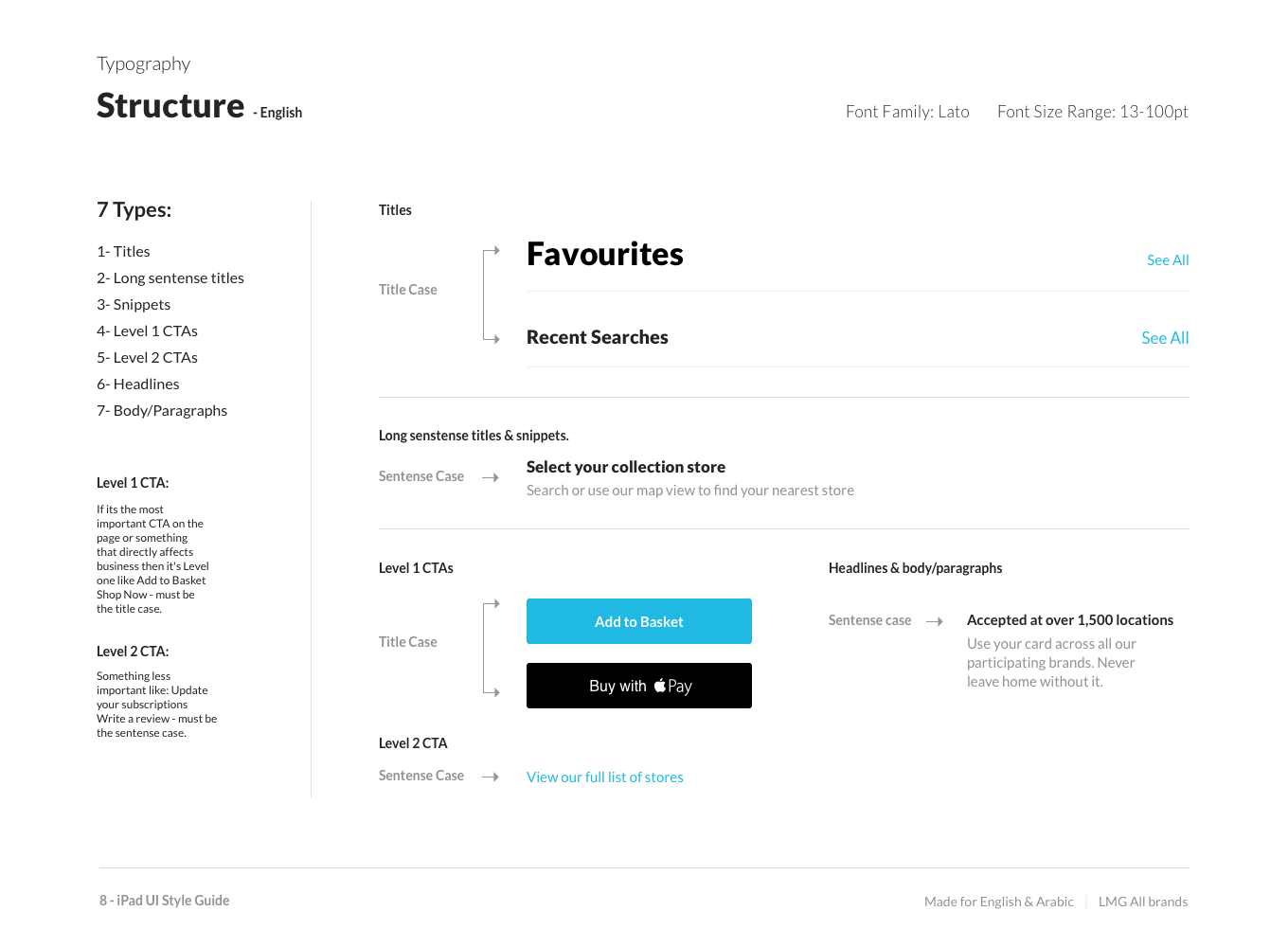
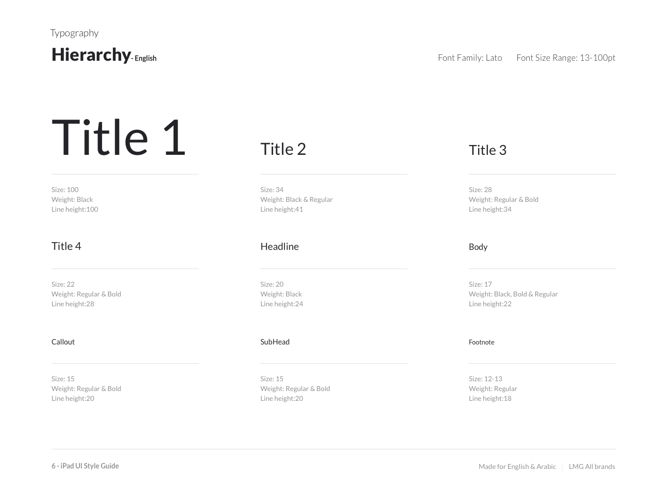
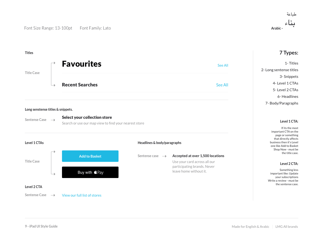
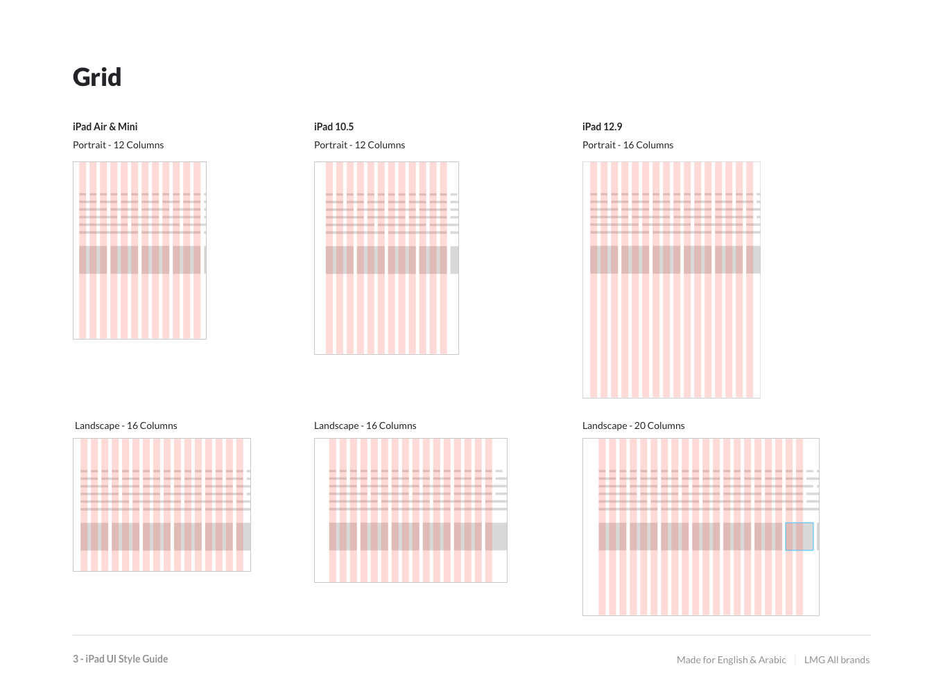
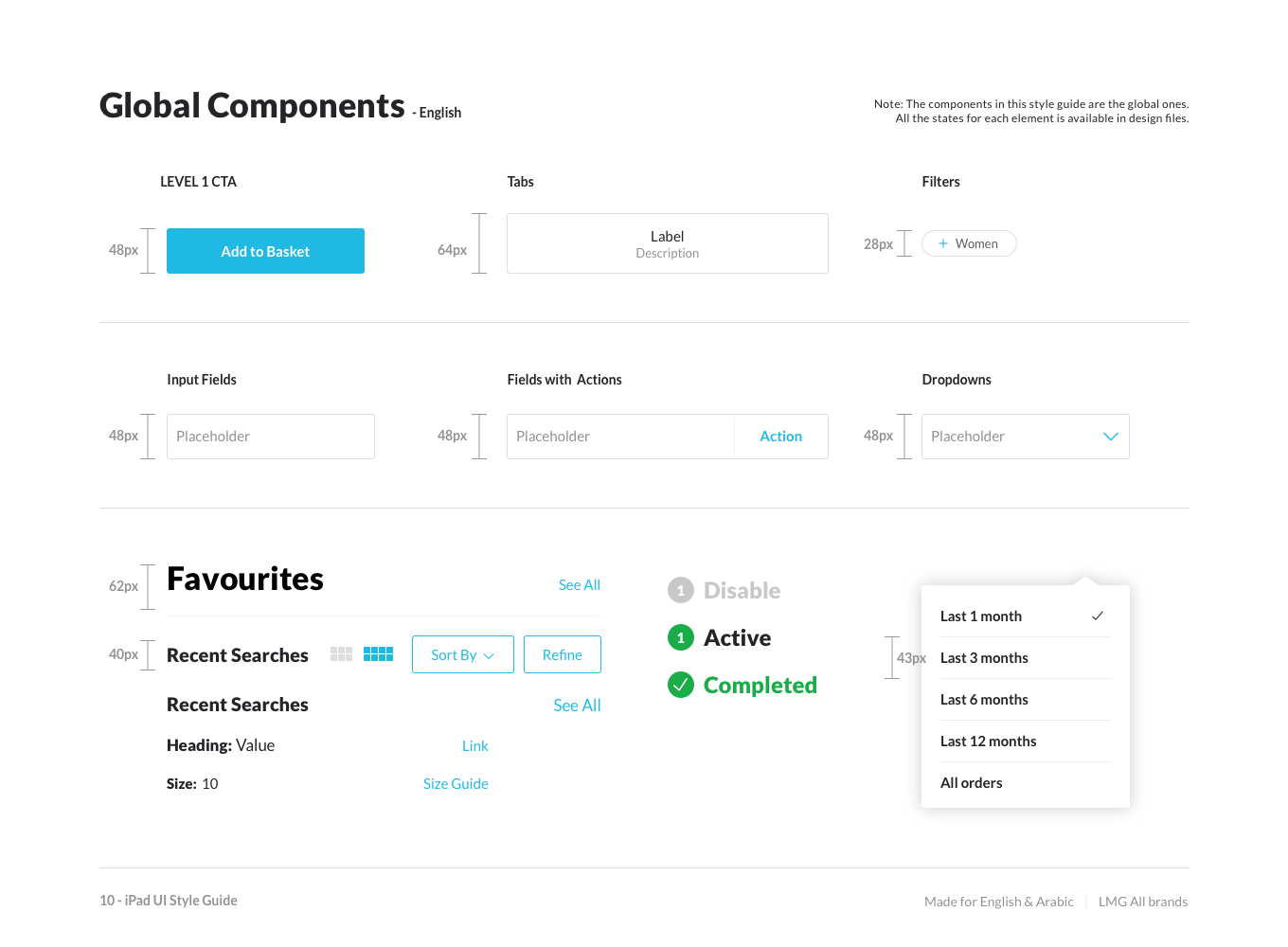
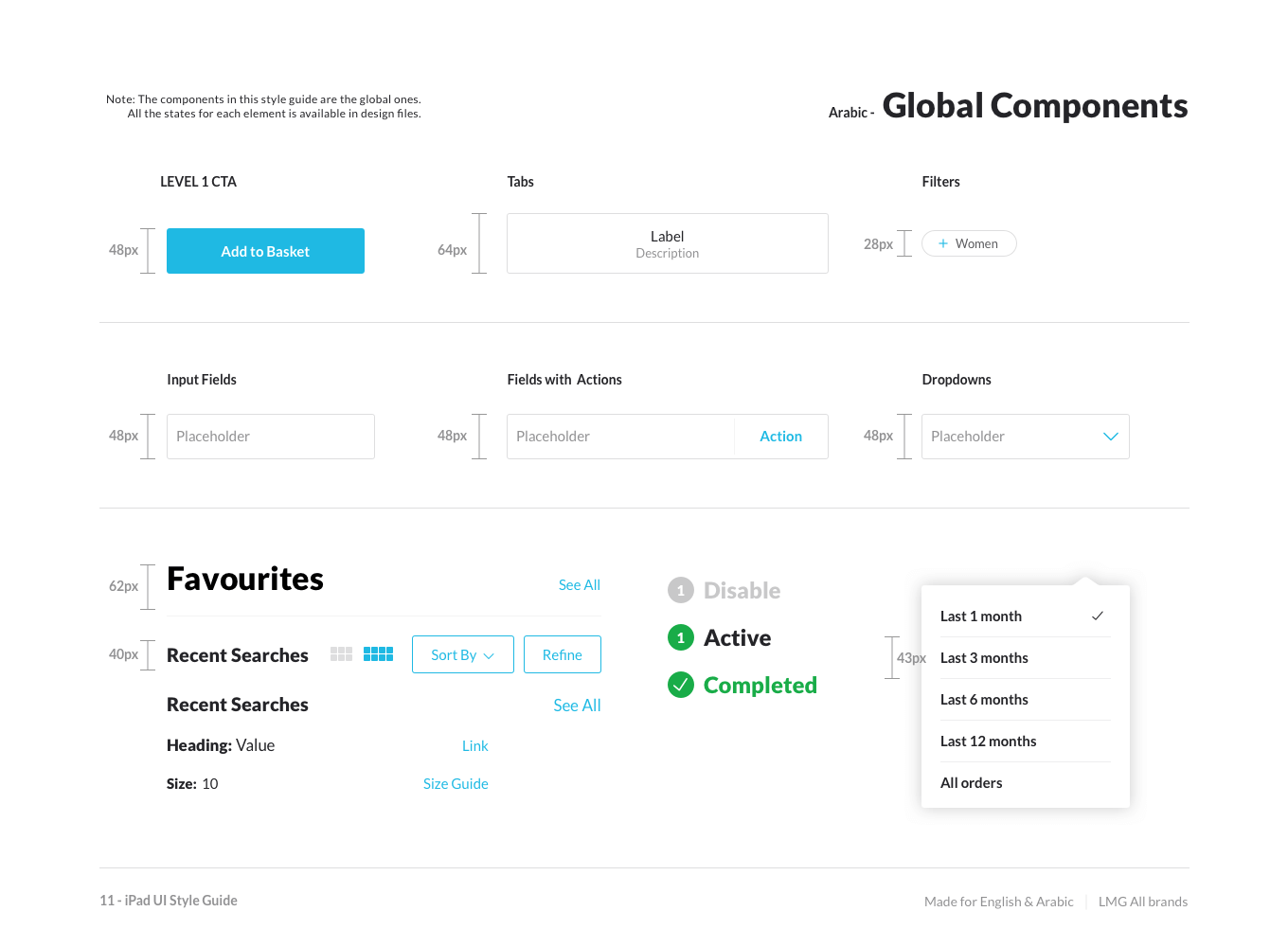
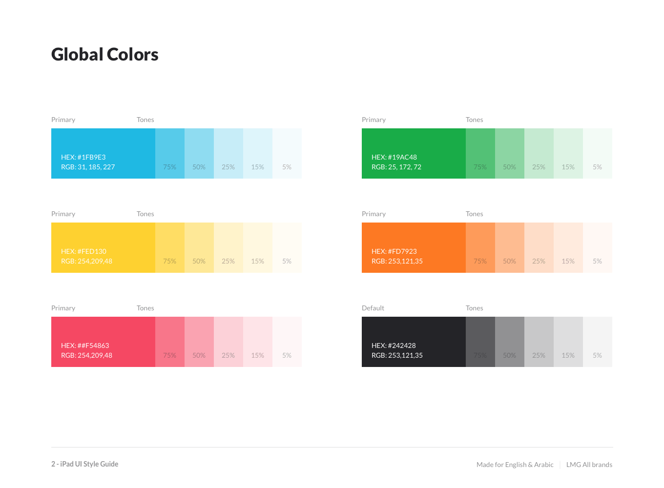
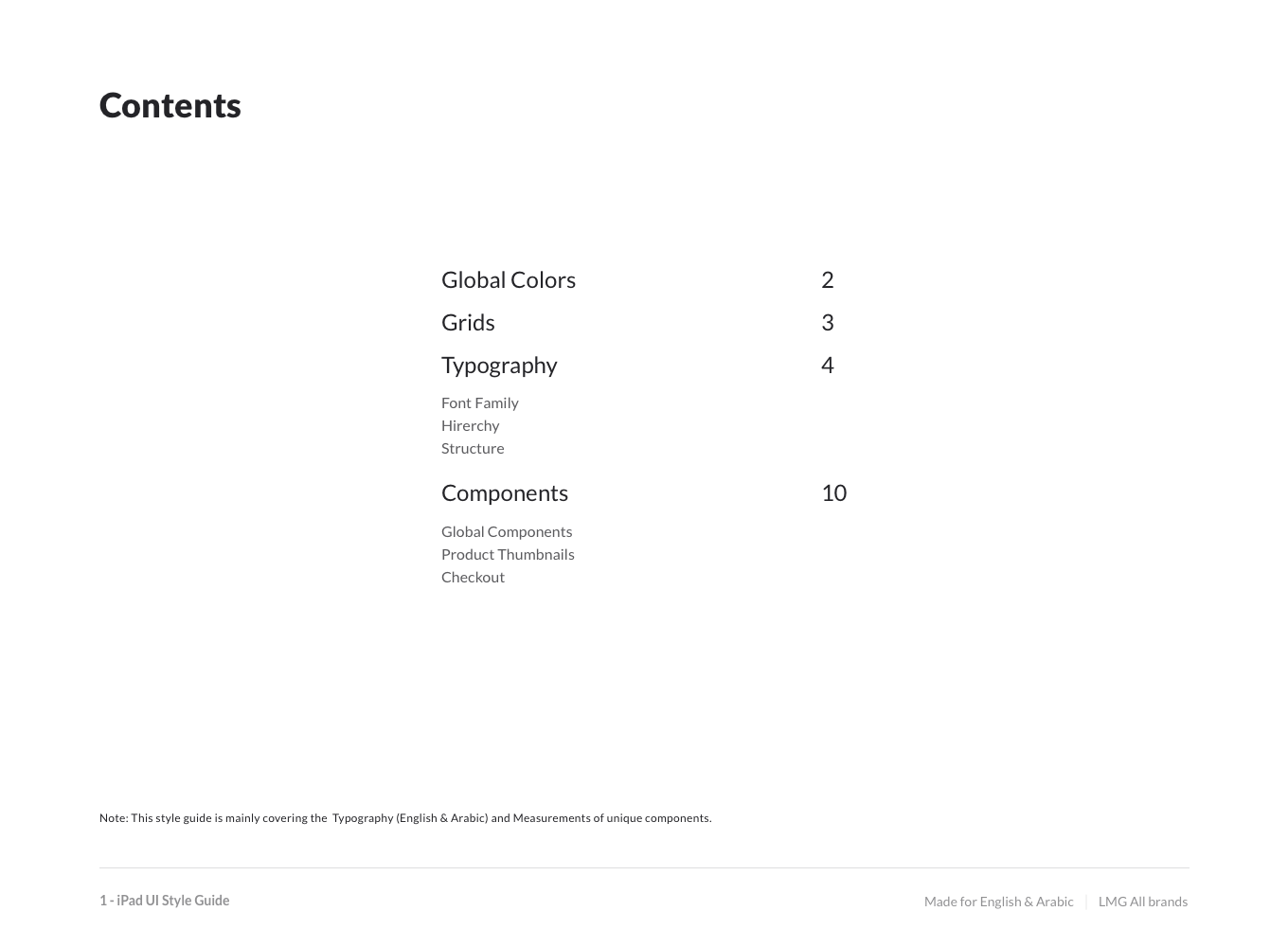
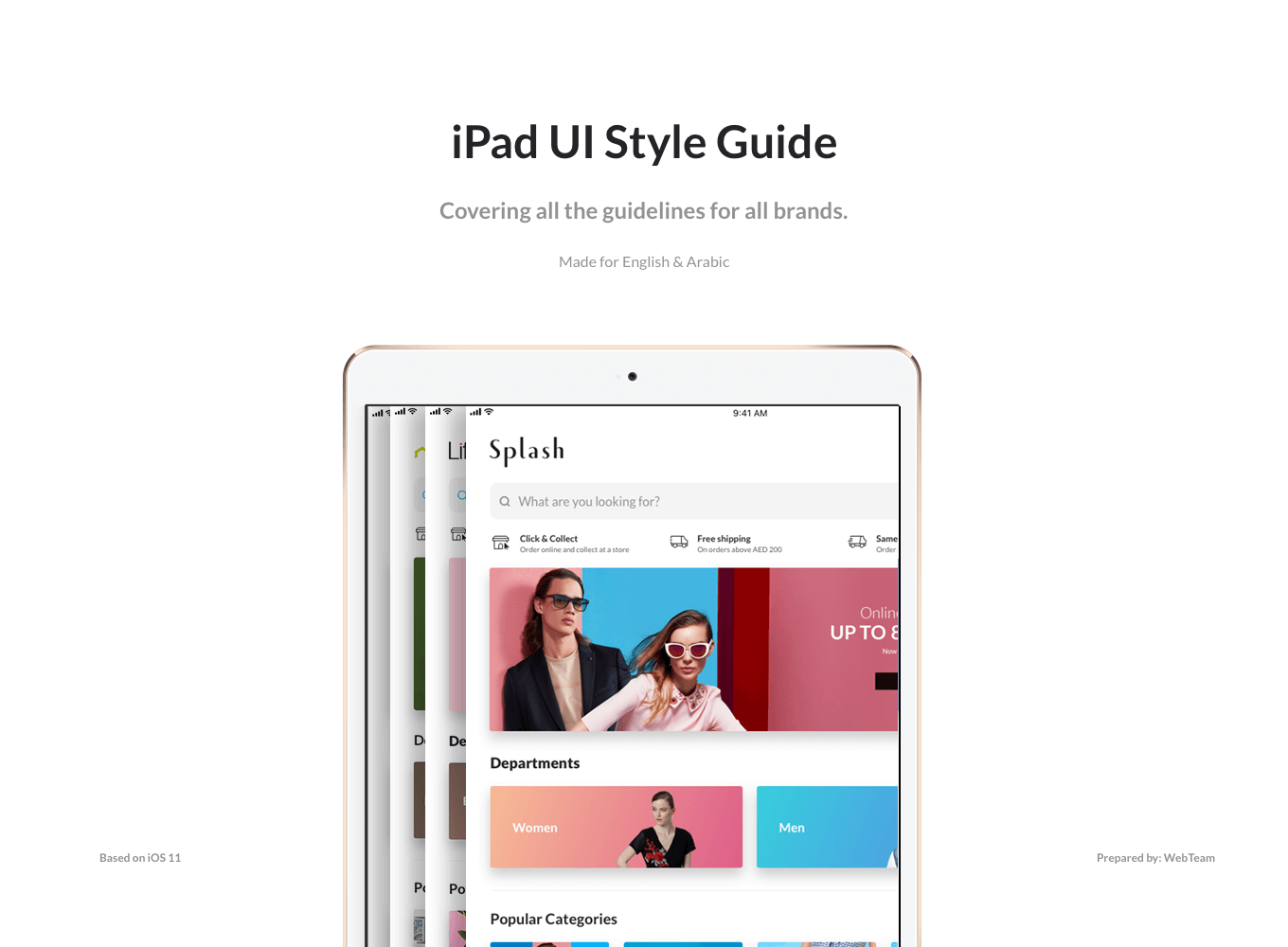
Style Guide
After completing the project I created the Style guide document to communicate with developers.